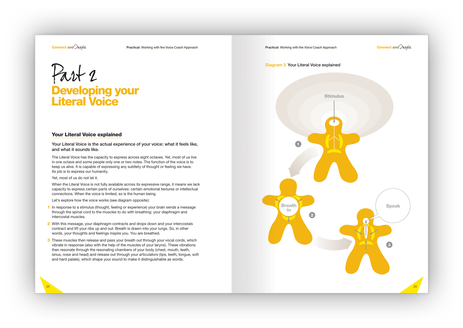
Design visuals
The booklet's cover design.

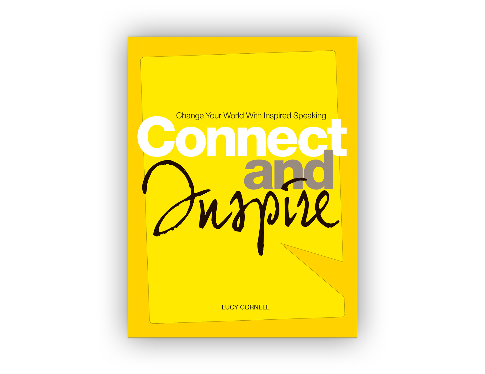
Above: The design motif for the textbook is a speech bubble, pointing inwards — a symbol for the inner voice. 

Double-page layout design.
Double-page layout design showing a chapter-heading page.

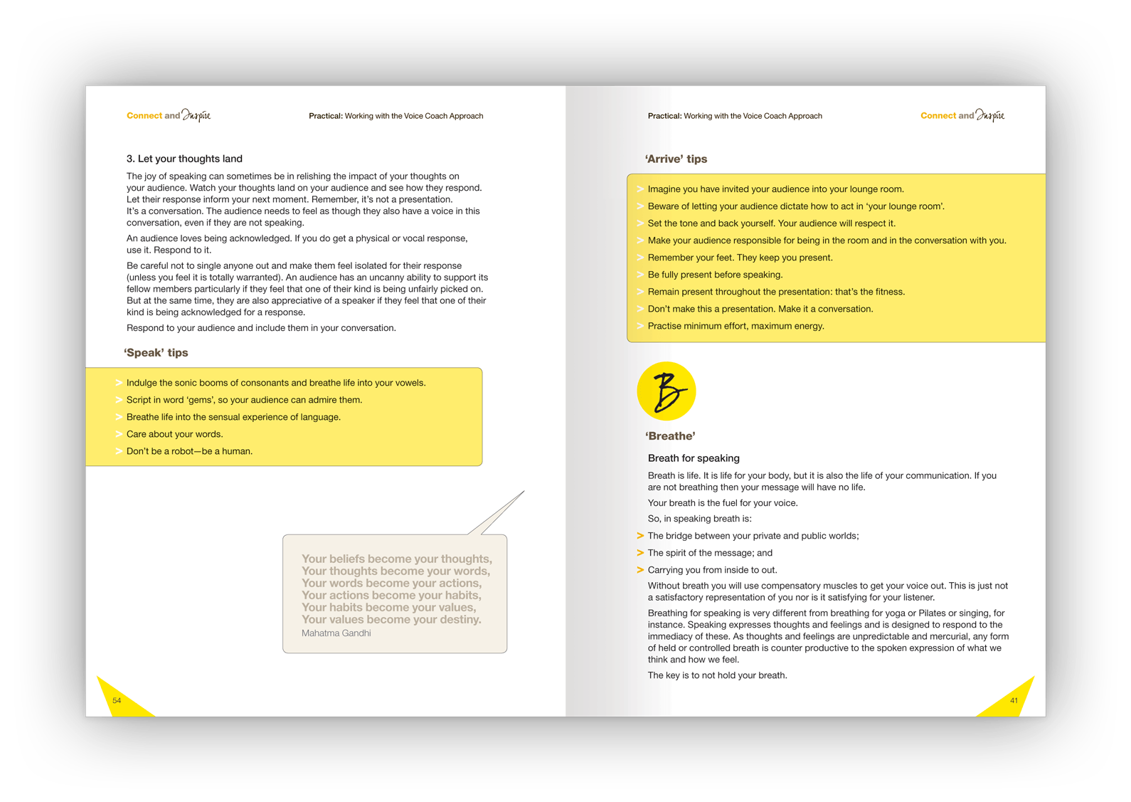
Above: Yellow is the brand colour and is featured throughout.

Double-page layout design.
Client testimonial 
“I highly recommend James Armstrong. He designed and produced my first book and it was a brilliant outcome for my business. James has a very strategic and thorough approach. His experience has brought real value to the final product (well beyond what my expectations were).” 
Company Director​​​​​​​ 
Double-page layout design.
Double-page layout design showing a feature image of Autumn leaves.

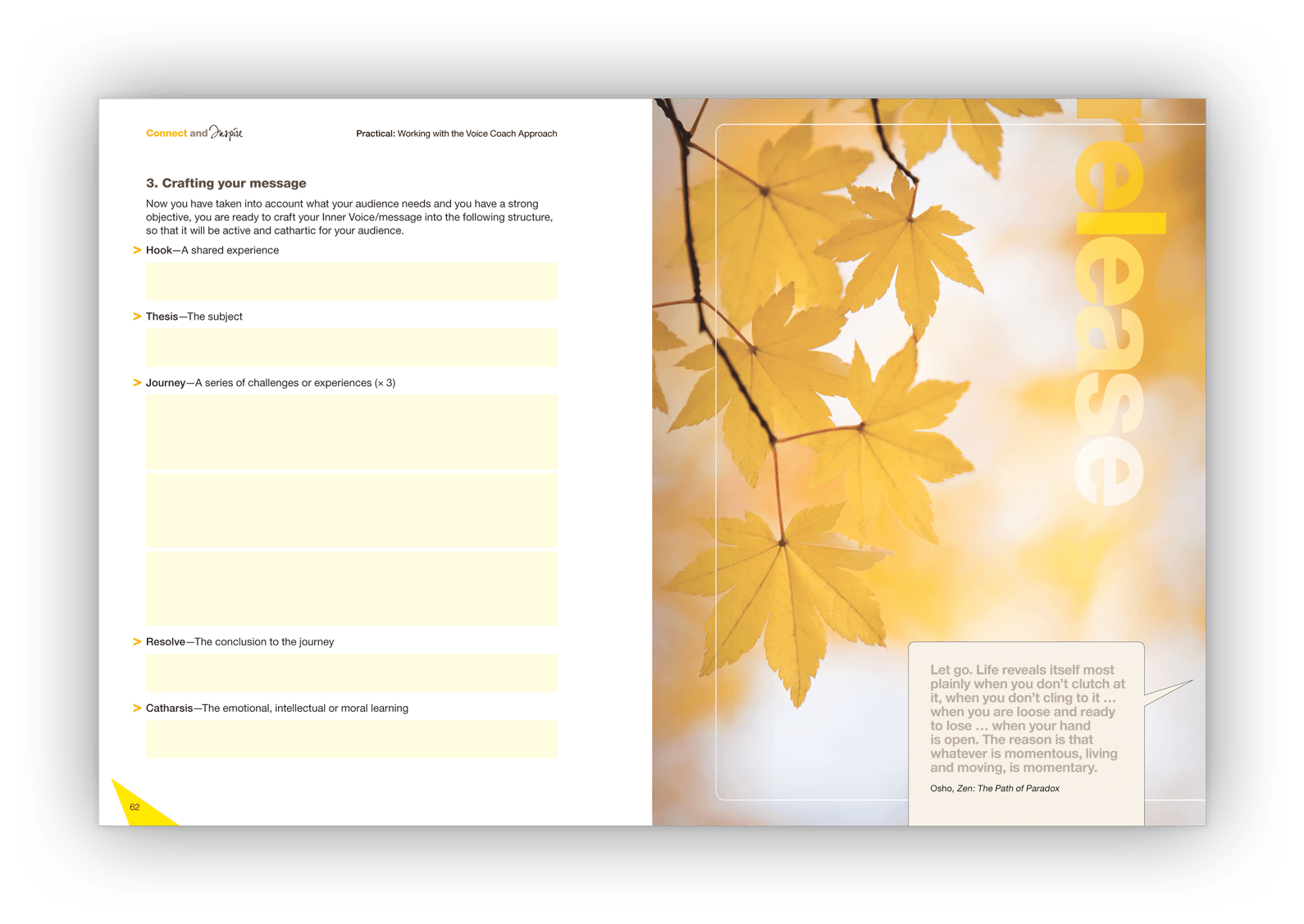
Above: Images and typography were evocative, creating a counterbalance to the textbook’s content.

Double-page layout design.
The booklet's back cover design.

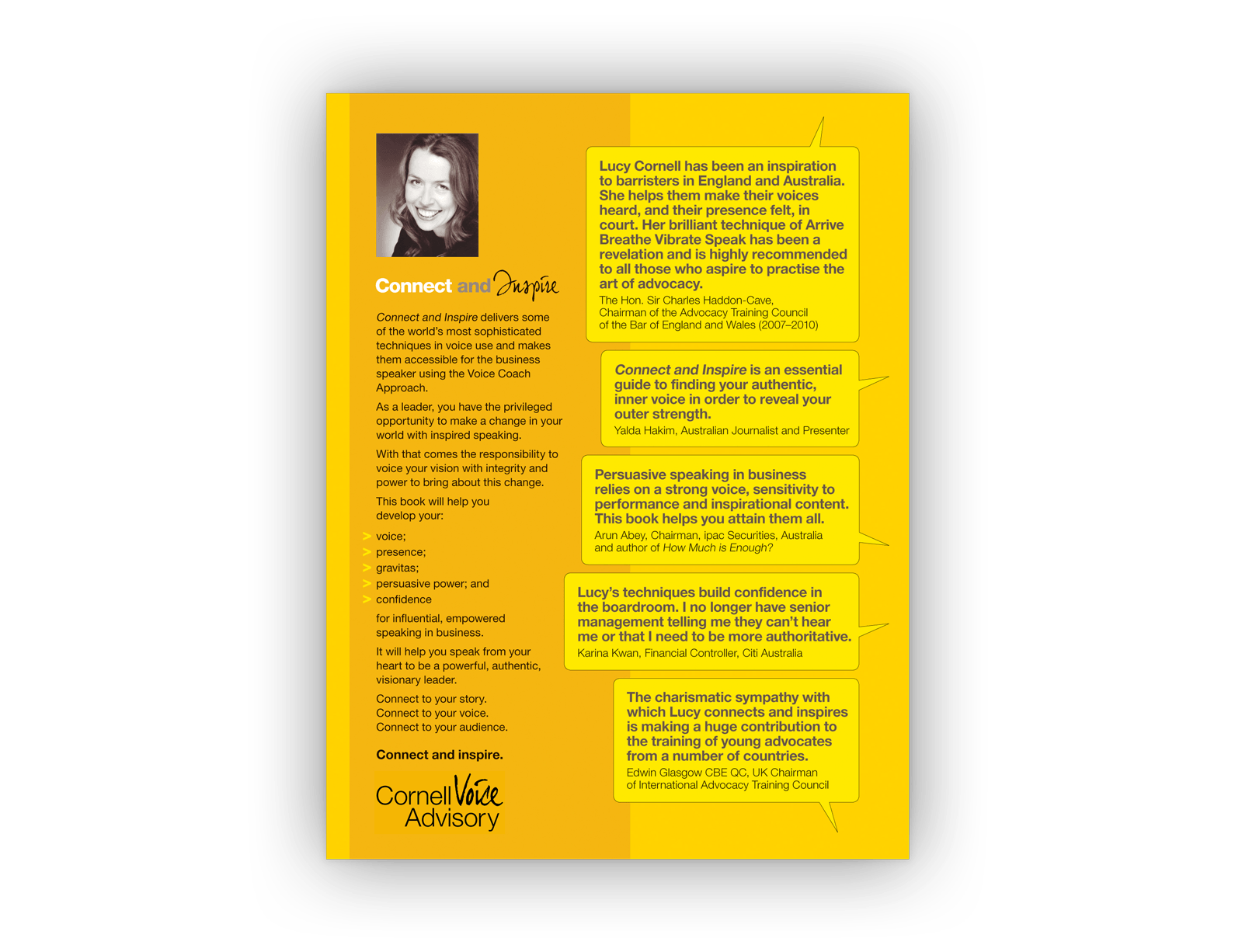
Above: The back cover contained client testimonials within the same speech bubble design motif.

The story behind the design 
The Cornell Voice Advisory works with individuals and businesses to develop speaking powers and create voices of leadership and influence. 
The teaching process is theoretical, practical and mythical and introduces clients to unfamiliar concepts. Good communication design was key. 
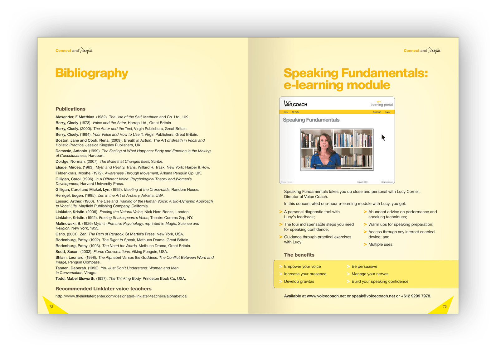
To explain the voice-training techniques and philosophies, facilitate the coursework that attendees compete, and raise the profile of the company, a textbook/marketing booklet was conceived but needed to be designed.  
The textbook design 
The Cornell Voice Advisory helps their clients connect with their inner voice. 
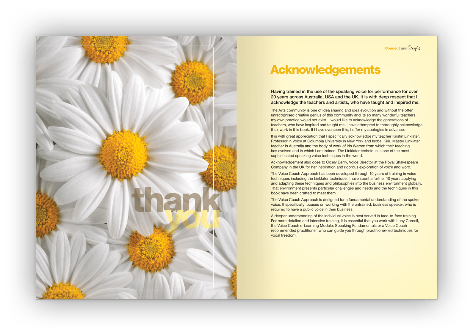
Echoing this, the design motif for the textbook is a speech bubble, pointing inwards. 
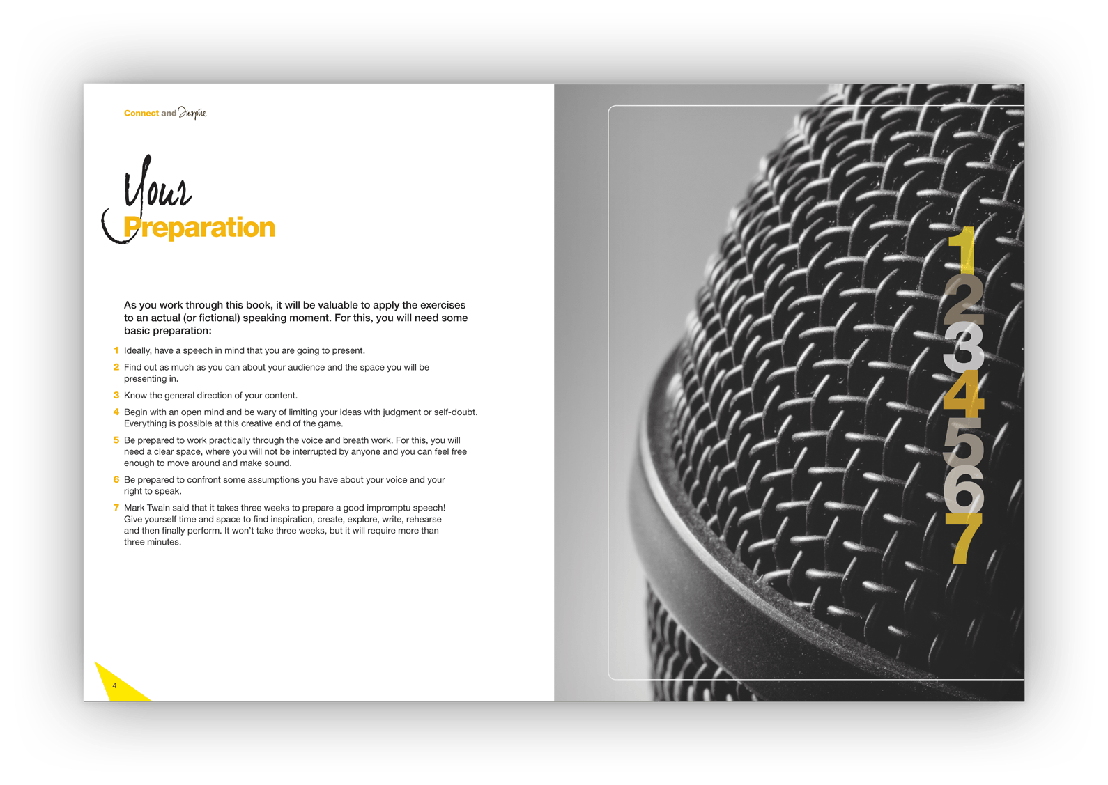
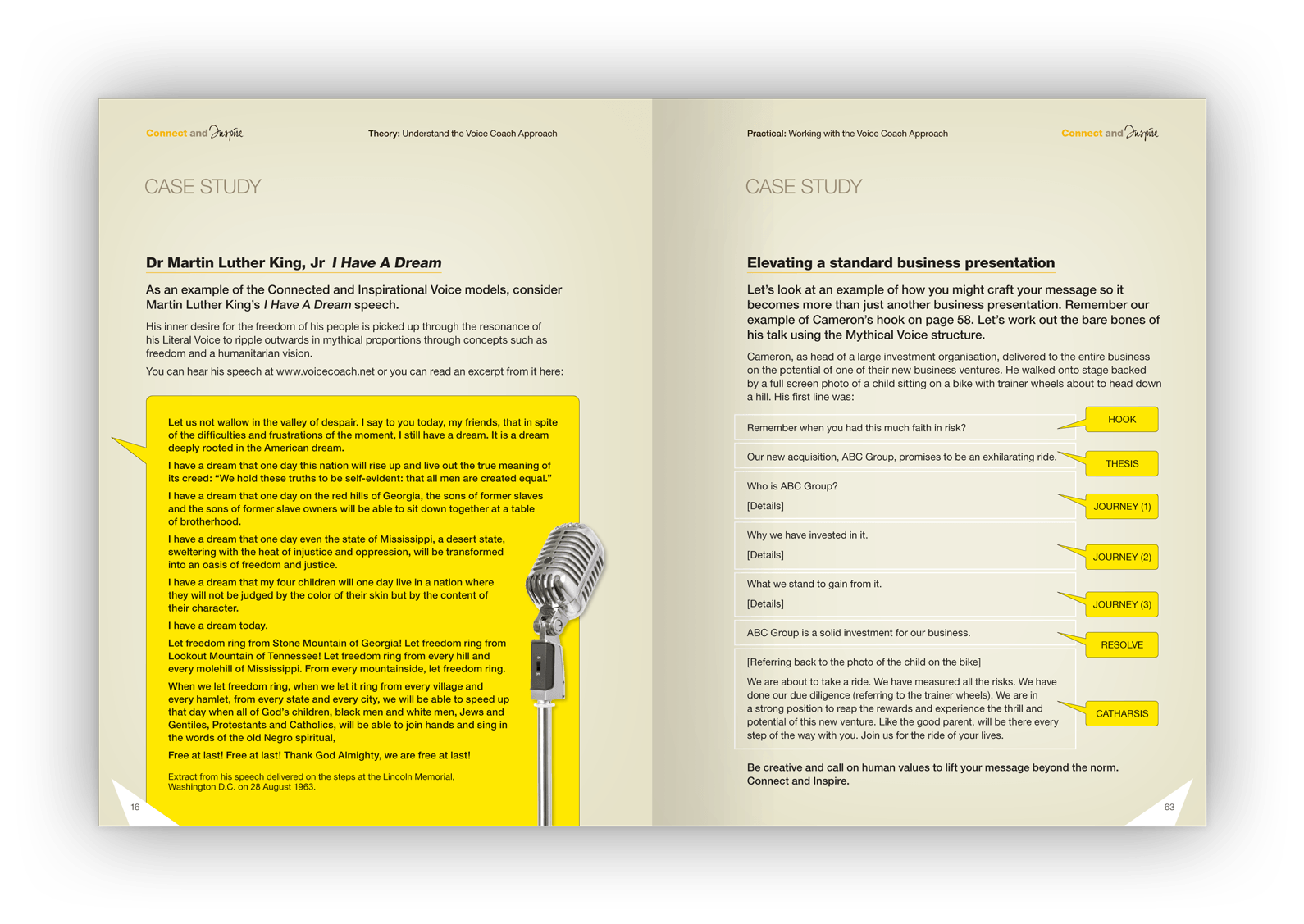
Evocative images are used to represent voice, discovery of voice, expression of voice and the techniques used to facilitate and centre voice development work.  
Specifications 
> 84-page printed booklet
> An irregular 175mm x 230mm size (small enough to feel like a book, large enough for practical written exercises). 
Creative awards 
Honorable Mention — Creativity Annual Awards 
Award of Excellence — International Creative Media Awards. 
Want to know more?
Contact James Armstrong for a chat about this project, your project, or a design quote. 

View another design project

Newsletter design for Qantas employees
This newsletter had to follow restrictive internal brand guidelines yet still achieved visual distinctiveness for the unit.
Annual report design for government
How do you portray health complaints as something positive? As this annual report design demonstrated: quite happily.
Label designs for water range
With a complex proposition to communicate, this water also needed a unique design to stand out in a cluttered category.
Financial literacy infographic design
An entertaining insight into the financial strains that Fido and Felix can place upon pet-loving Australians.
Dispute resolution infographic design
This infographic is helping the regulator help financial services firms develop better dispute resolutions for consumers.
Newspaper design for Qantas employees
A five-year contract designing the monthly editorial for ‘Qantas News’: Qantas’s flagship newspaper for employees.
Booklet design for Tourism Australia
How do you market Australia to the world? This booklet design introduced ambassadors and influencers to our nation’s brand.
Guidebook design for Qantas employees
Qantas’s impressive brand story, history, culture and values feature in this handy guidebook for employees.
Product launch campaign for Qantas
Workplace changes can be hard. This awareness campaign emphasised the benefits for workers, not the corporation.
Suite of brochures for designer products
These brochures were a balancing act between aspirational imagery and a need for detailed technical information.