Dividing line.
Design visuals 
One of the newspaper's cover designs showing a large Qantas logo — part of the brand's major redesign in 2007.

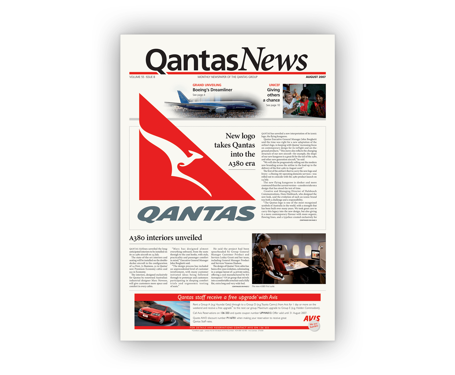
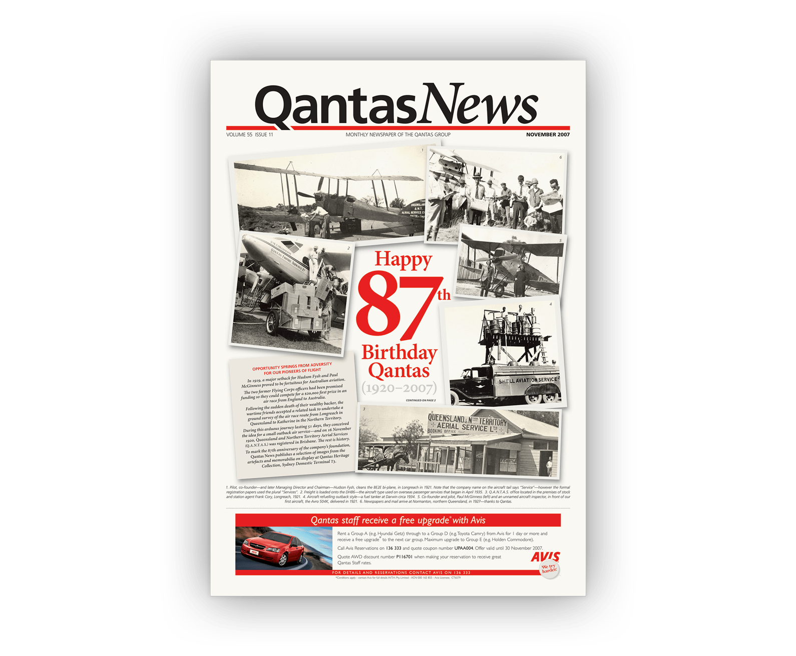
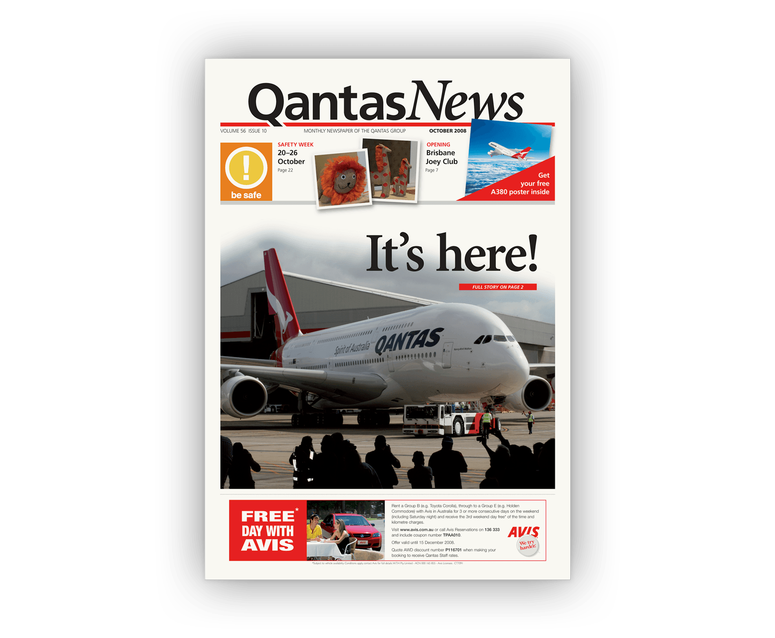
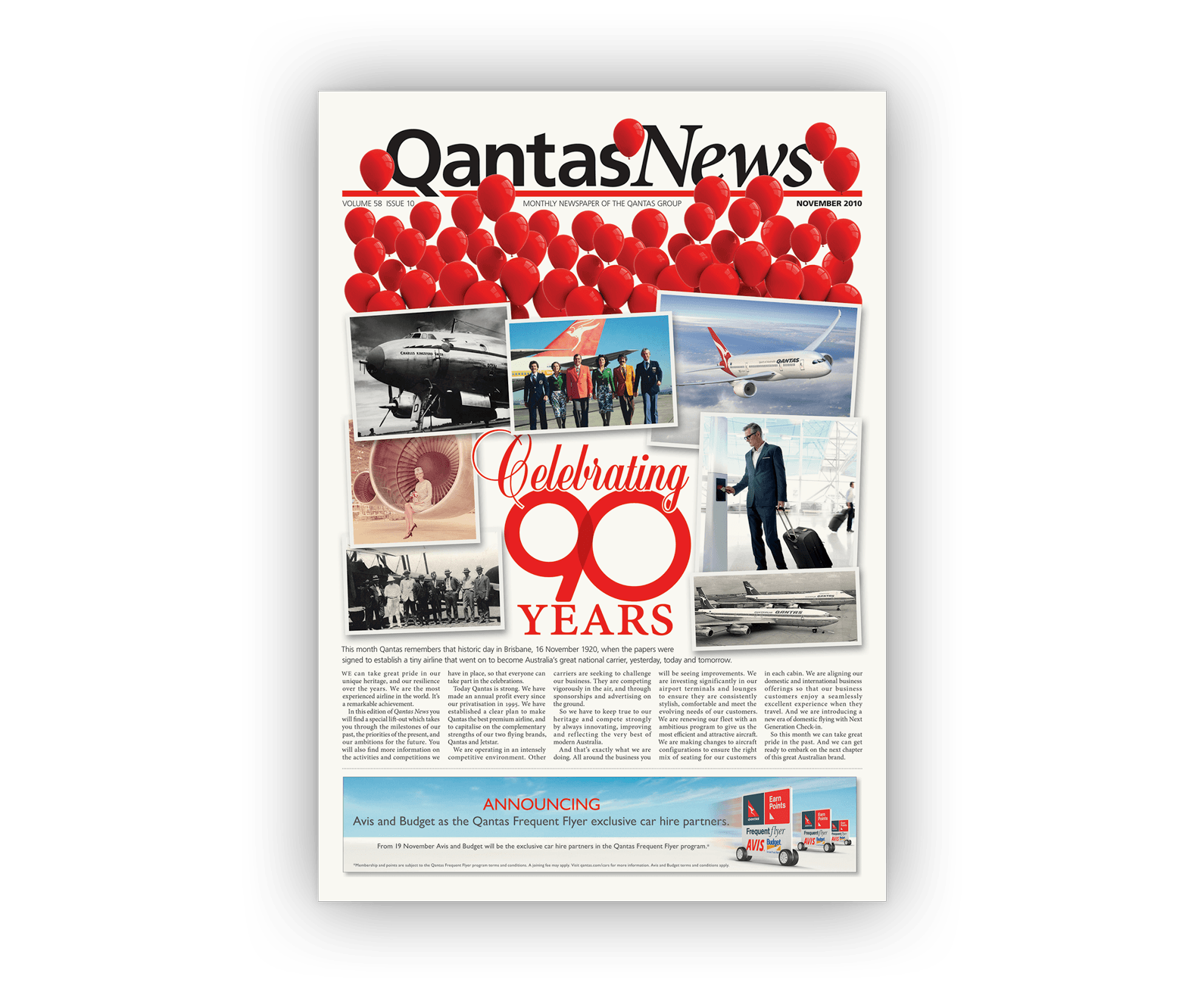
Above (and following): Over five years, nearly 60 issues of Qantas News were designed and produced. These are some of our favourite cover designs showing our approach to newspaper design.

One of the newspaper's cover designs celebrating Qantas's 87th year in operation and showing a montage of historic black-and-white photos from Qantas's aviation history.
One of the newspaper's cover designs showing the arrival of Qantas's first Airbus A380 in Qantas livery.
One of the newspaper's cover designs celebrating Qantas's 90th year in operation showing dozens of red balloons bursting out of the page and over the masthead.
Double-page layout design.

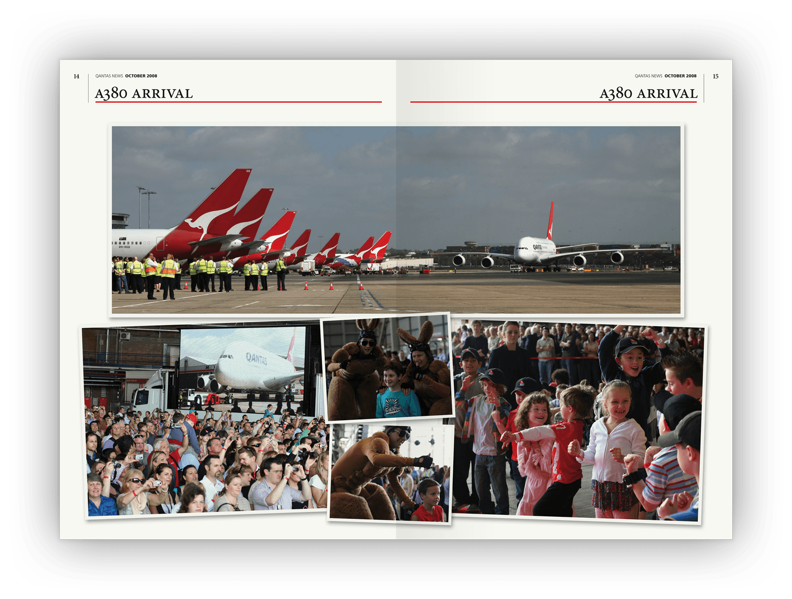
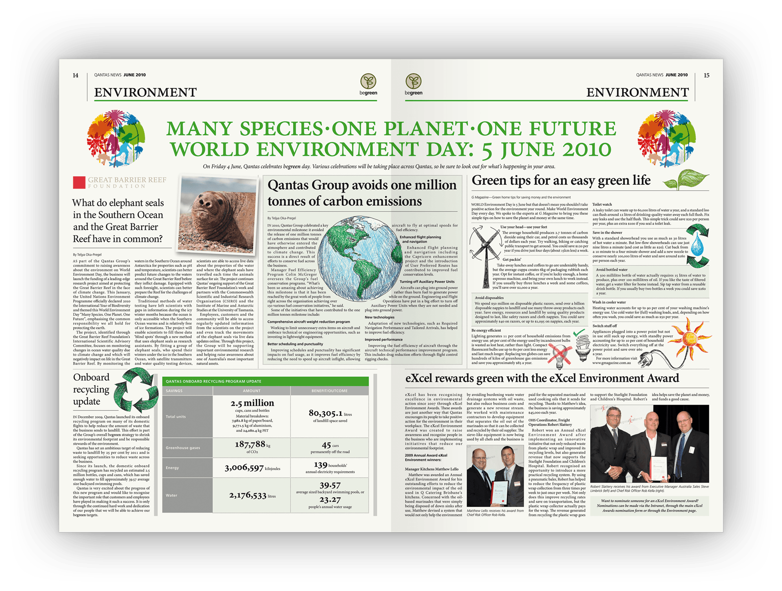
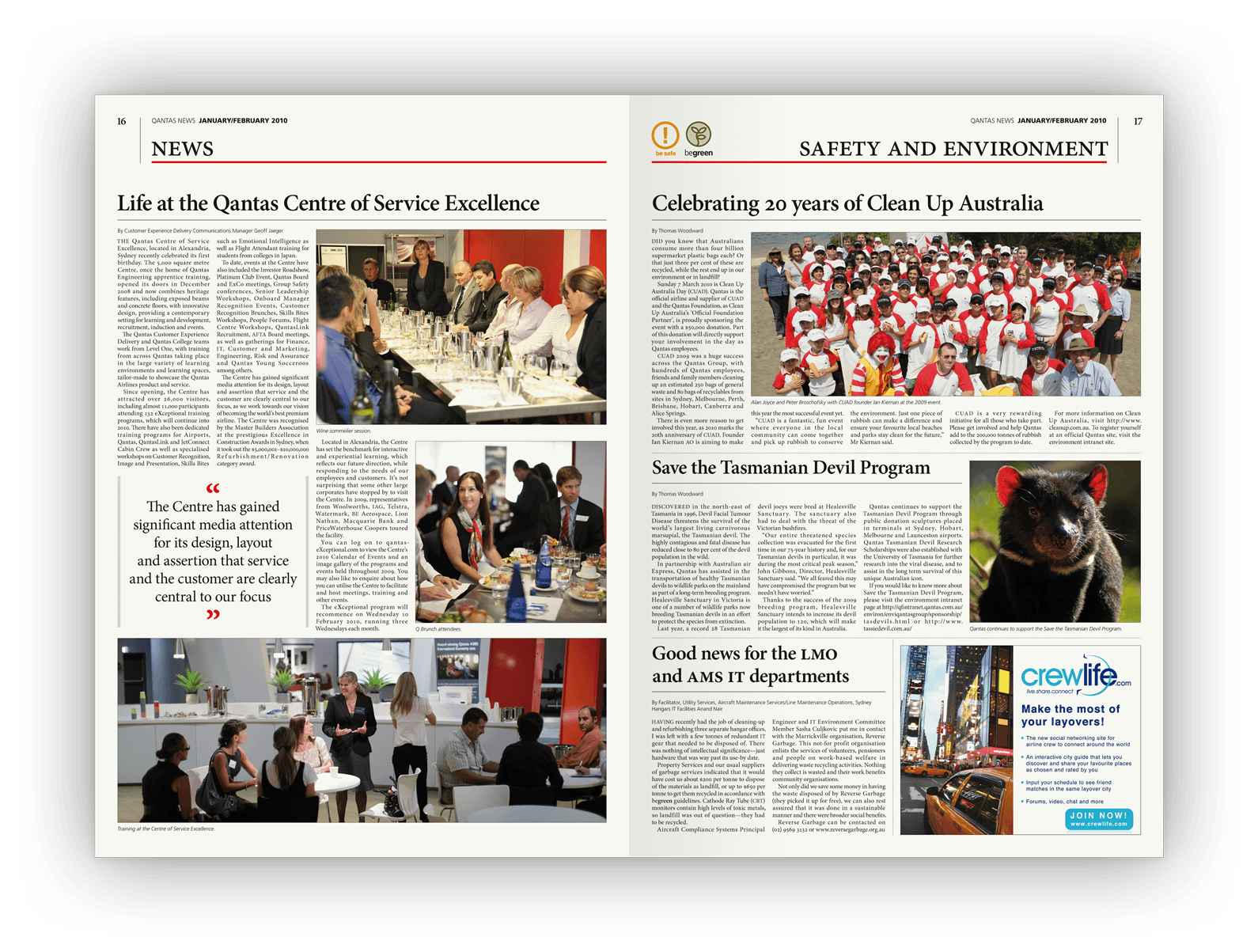
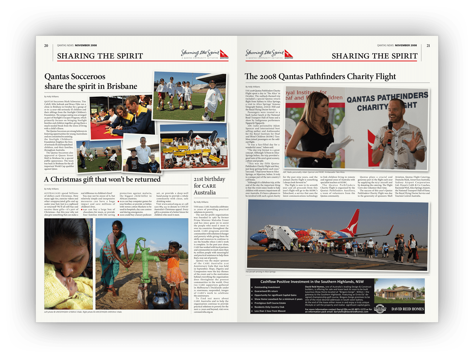
Above (and following): Each issue contained themed sections. A cross-section of double page layout designs offer a cross-section of the editorial design over the years.  

Double-page layout design.

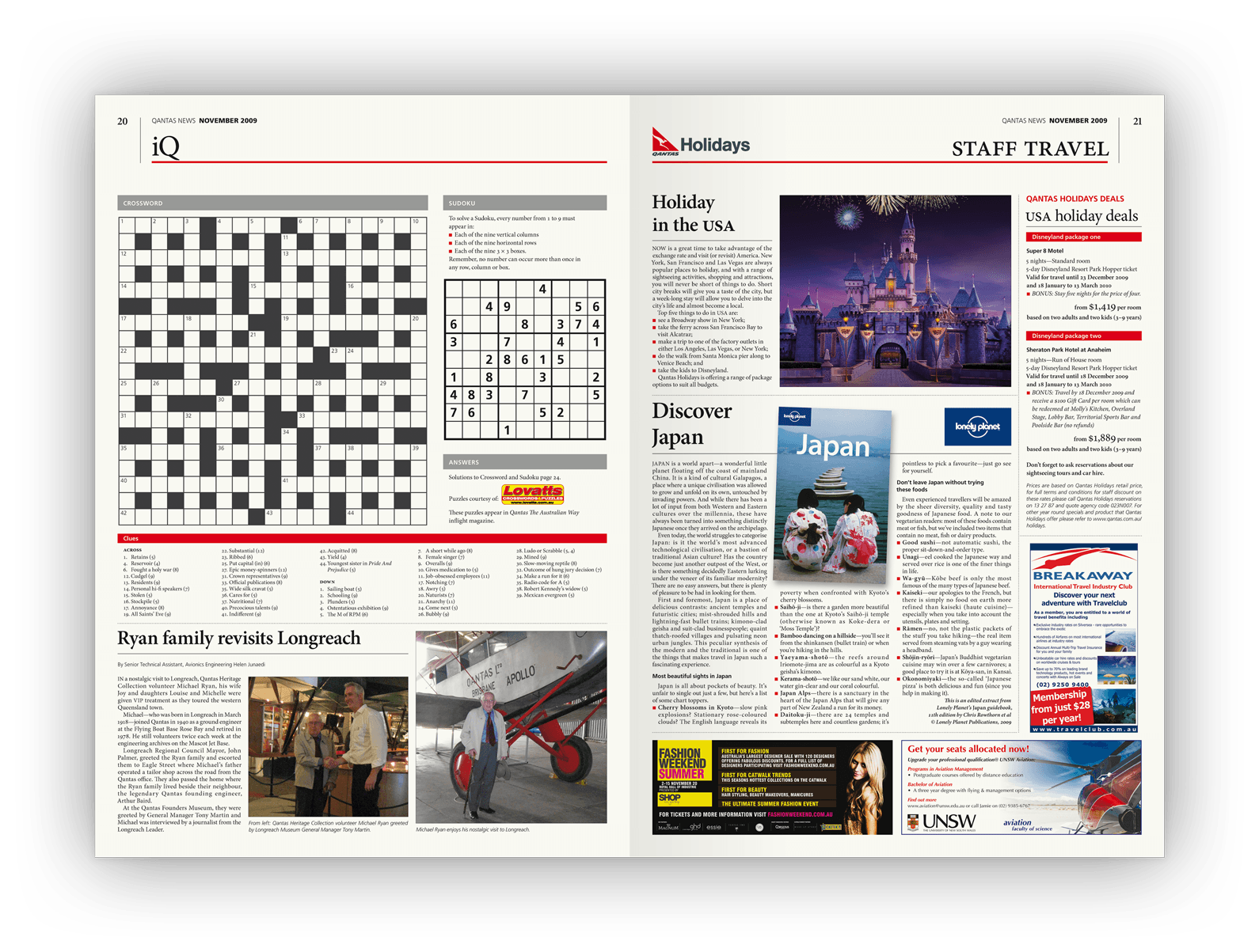
Above: Like most newspapers, the crossword and sudoku were monthly favourites.  

The story behind the design 
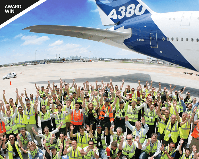
Qantas News has been Qantas’s primary internal communication news source for its staff for over 60 years, breaking news about significant corporate and airline industry events: Qantas’s rebranding, fuel prices, the Airbus A380, volcanic eruptions, workforce industrial action, the grounding of the fleet, airport terminal refits, milestones and celebrations.
Its design and production was trusted to us for five years.  
The newspaper design 
Qantas News was designed to emulate the look and feel of a mainstream newspaper while maintaining links to brand.
Unlike visually indulgent publications with generous margins and full-page images, Qantas News needed a utilitarian design to support editorial and advertising sales. Balancing that functional approach, with design aesthetics, was the monthly challenge. 
Over five years, we designed nearly 1,500 page layouts published over 60 monthly issues. We partnered with different managing editors and specialist media sales agency and newsprint print production companies. 
During our stewardship, the news, Qantas editorial teams, processes and management style changed as new people at Qantas performed key roles, yet the newspaper’s design remained consistent — an insight into the foresight, flexibility and strength of the original concept, editorial grid and typography.
Specifications 
> Five-year design and production contract for approximately 60 issues
> Tabloid-sized monthly newspaper
> Newsprint paper stock
> Typically 20–28 pages our issue.
Creative awards 
Silver Award — International Creative Media Awards.
Want to know more?
Contact James Armstrong for a chat about this project, your project, or a design quote. 

View another design project

Newsletter design for Qantas employees
This newsletter had to follow restrictive internal brand guidelines yet still achieved visual distinctiveness for the unit.
Product launch campaign for Qantas
Workplace changes can be hard. This awareness campaign emphasised the benefits for workers, not the corporation.
Booklet design for Tourism Australia
How do you market Australia to the world? This booklet design introduced ambassadors and influencers to our nation’s brand.
Label designs for water range
With a complex proposition to communicate, this water also needed a unique design to stand out in a cluttered category.
Textbook design and company promotion
A clever design merged this company’s marketing promotion and coursework textbook into a single solution.
Label designs for wine range
Each label is an illustrative chapter in the winemaker’s story, celebrating each milestone with tongue-in-cheek humour.
Guidebook design for Qantas employees
Qantas’s impressive brand story, history, culture and values feature in this handy guidebook for employees.
Dispute resolution infographic design
This infographic is helping the regulator help financial services firms develop better dispute resolutions for consumers.
Annual report design for government
How do you portray health complaints as something positive? As this annual report design demonstrated: quite happily.
Financial literacy infographic design
An entertaining insight into the financial strains that Fido and Felix can place upon pet-loving Australians.