Design visuals
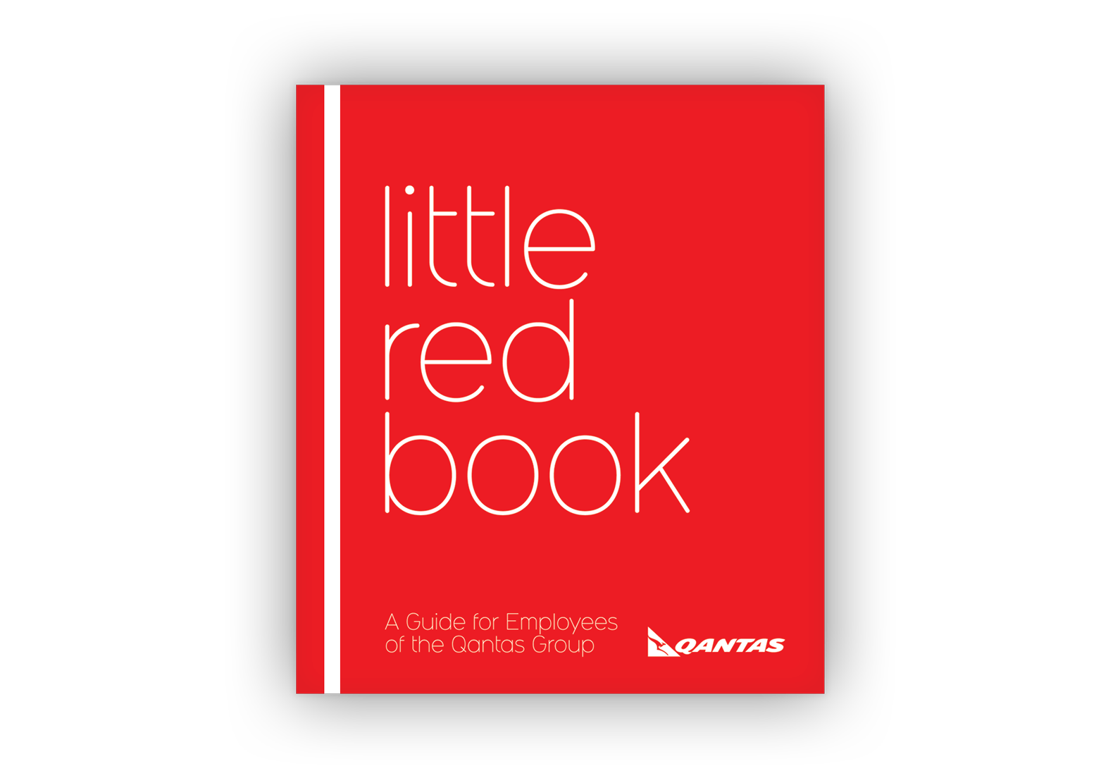
Above: The cover design is a playful twist of a ‘little black book’ using Qantas’s iconic brand red.
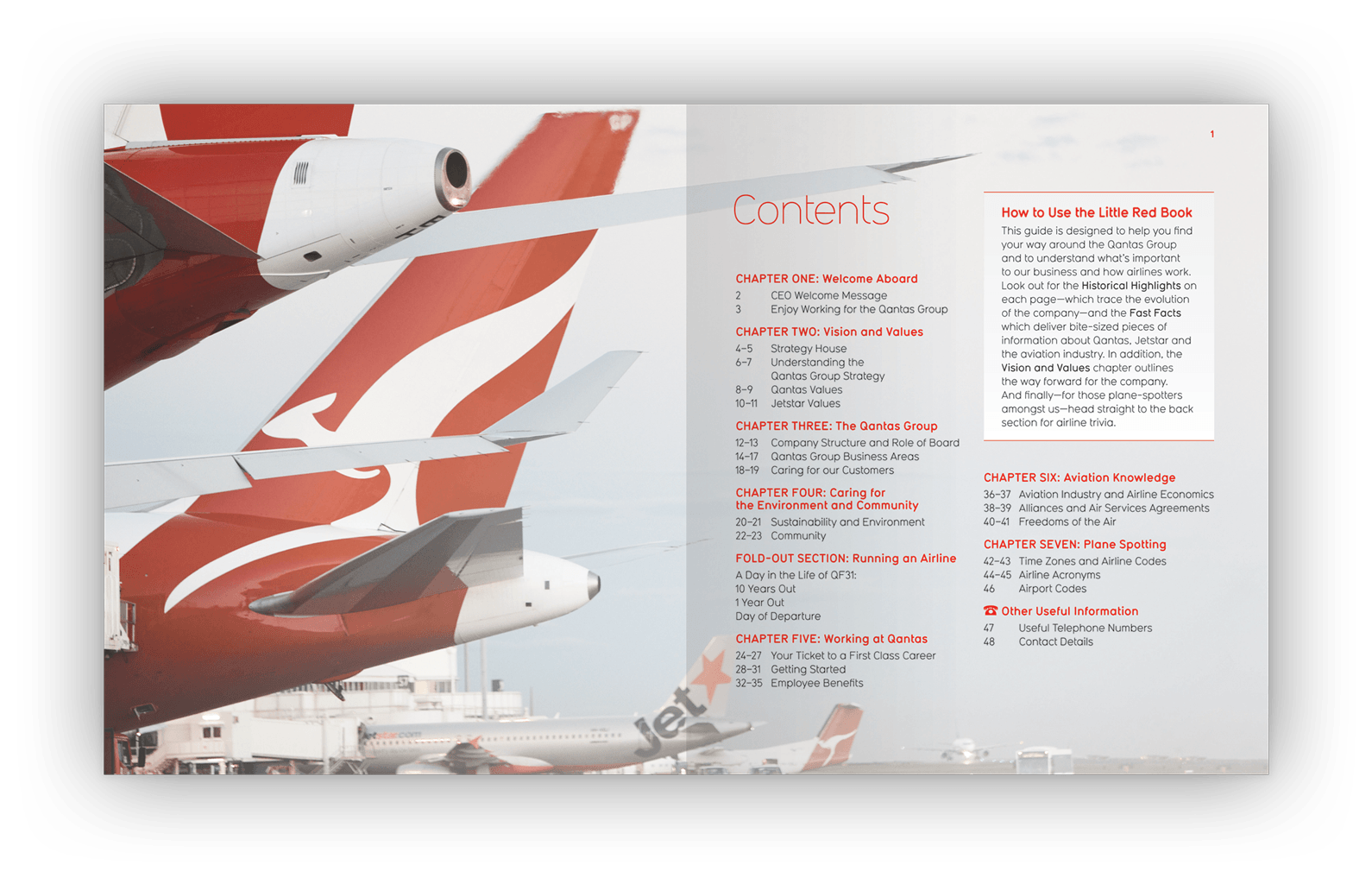
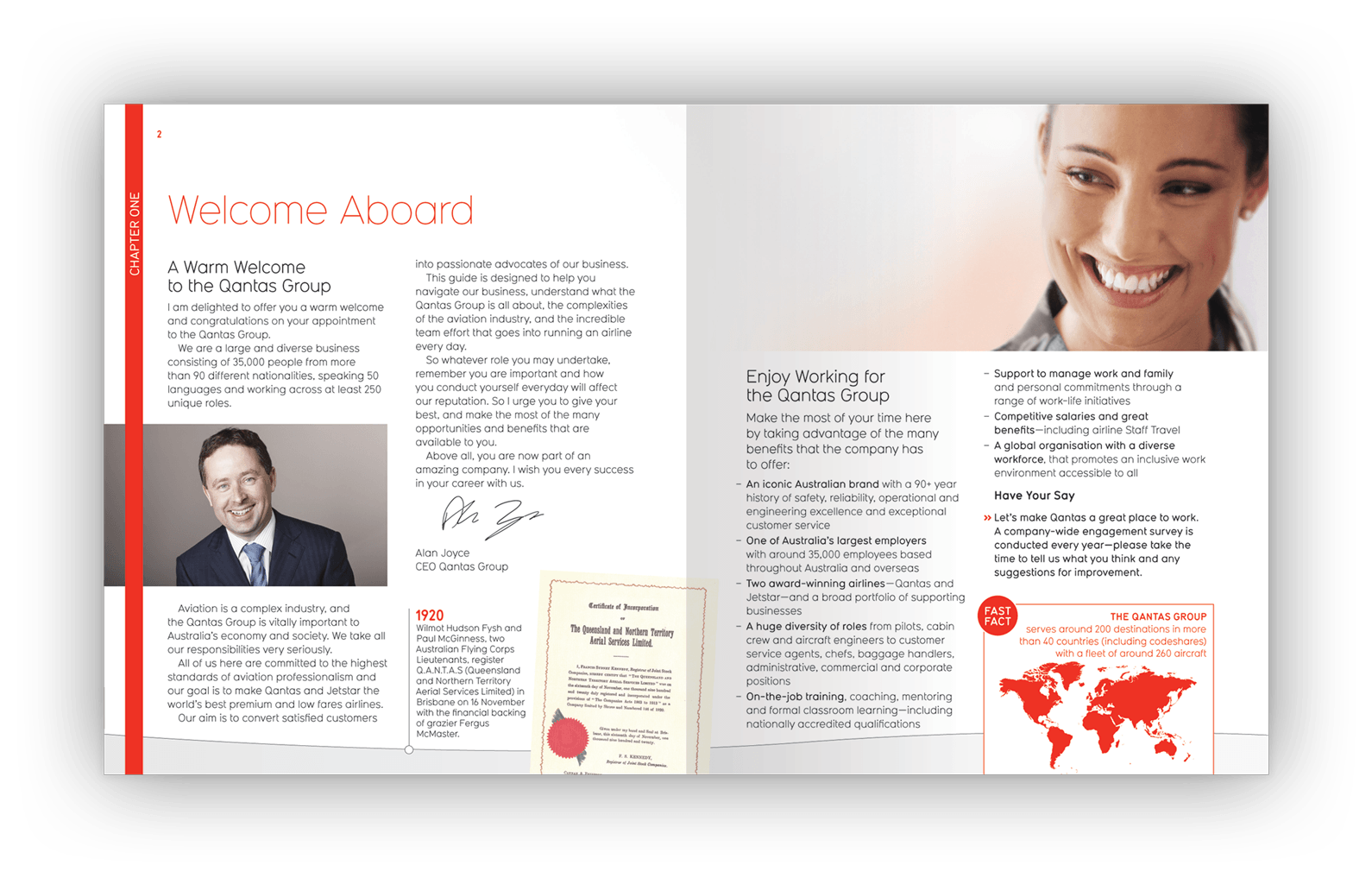
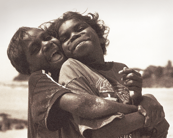
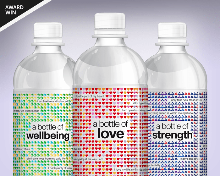
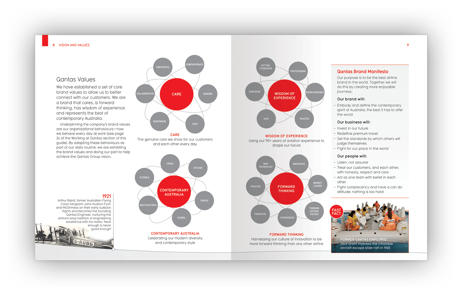
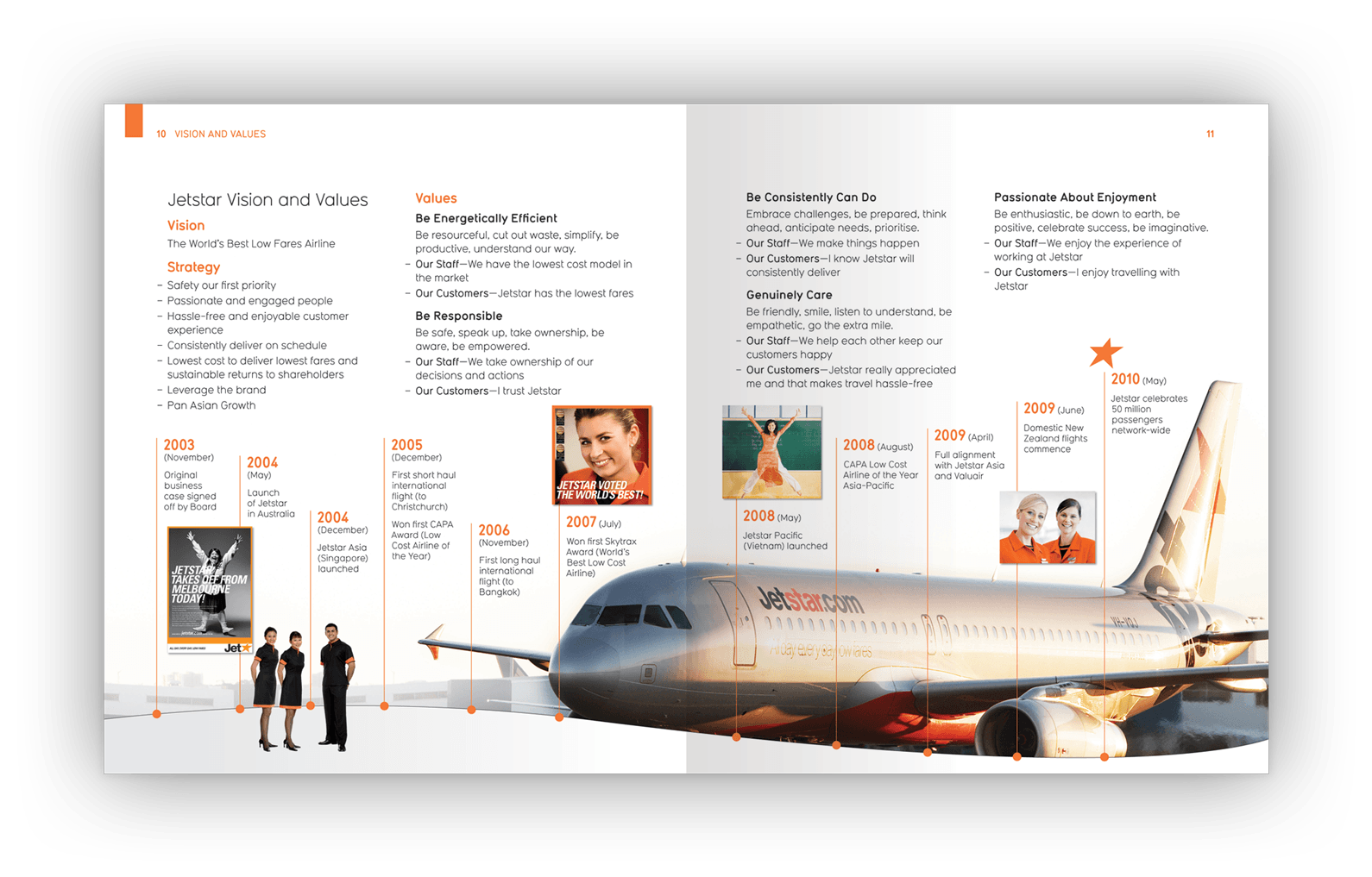
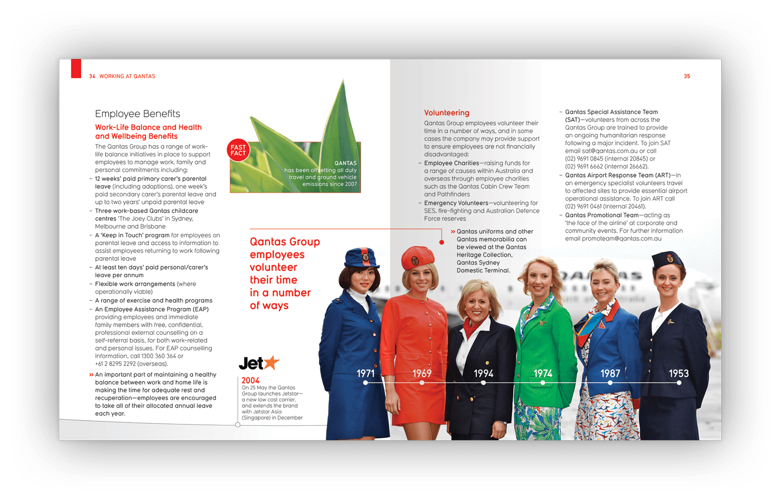
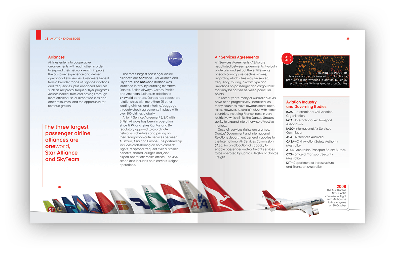
Above (and following): Each double-page spread used marketing imagery (from Qantas advertising campaigns), archival photos, relevant stock images, diagrams, pull-out boxes and highlight facts about Qantas to create pockets of interest.
Client testimonial
“I have no hesitation in recommending [James Armstrong’s] design agency. I have always found [him] to be excellent on all the projects I have worked with them on — high quality creative work, attention to detail, excellent customer service, always prioritised work, very transparent pricing and always delivered great value for money.”
Manager Workforce Communication (project manager for Little Red Book and Horizons newsletter)
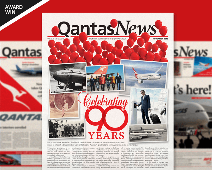
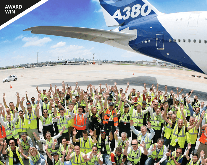
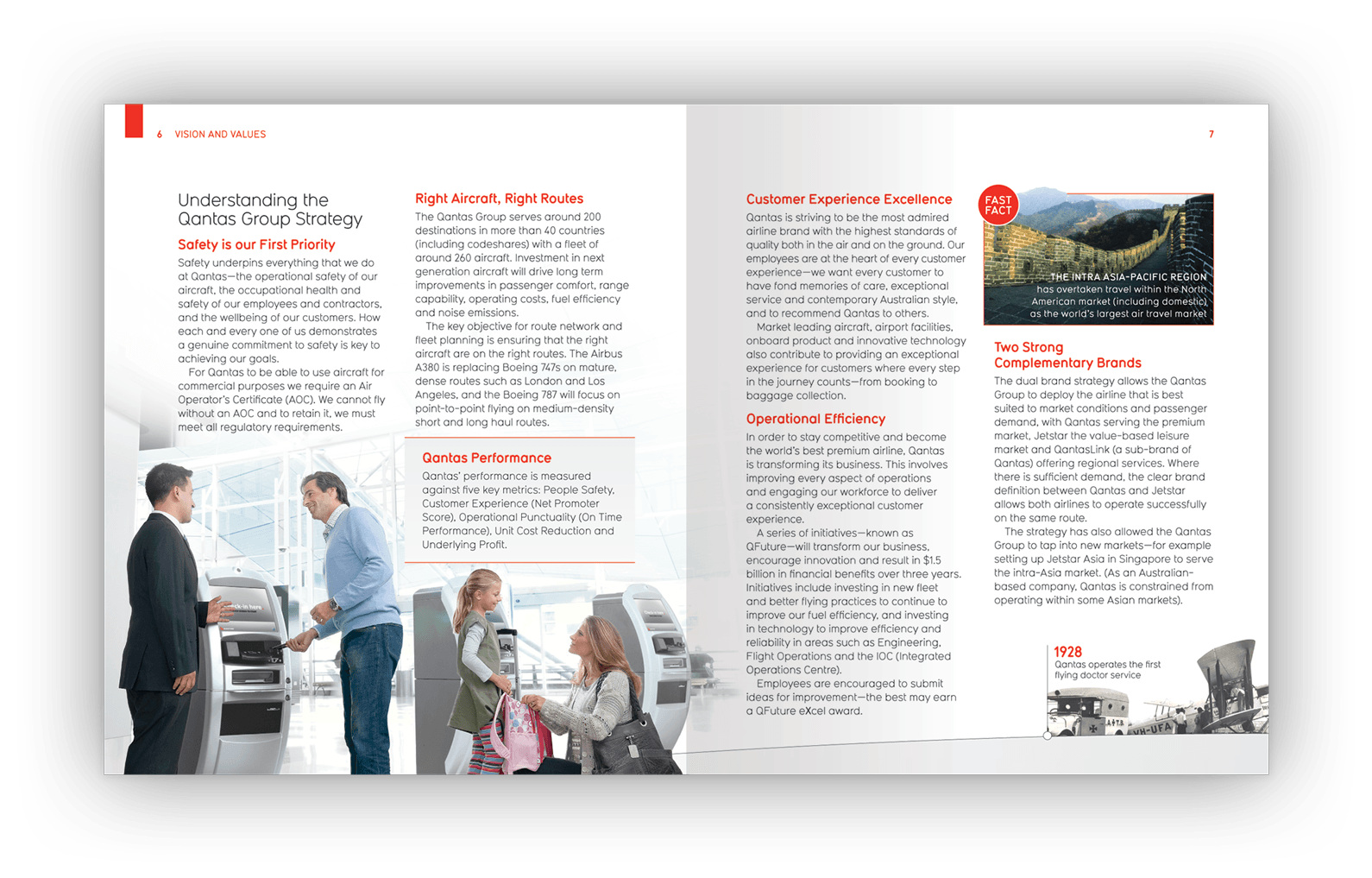
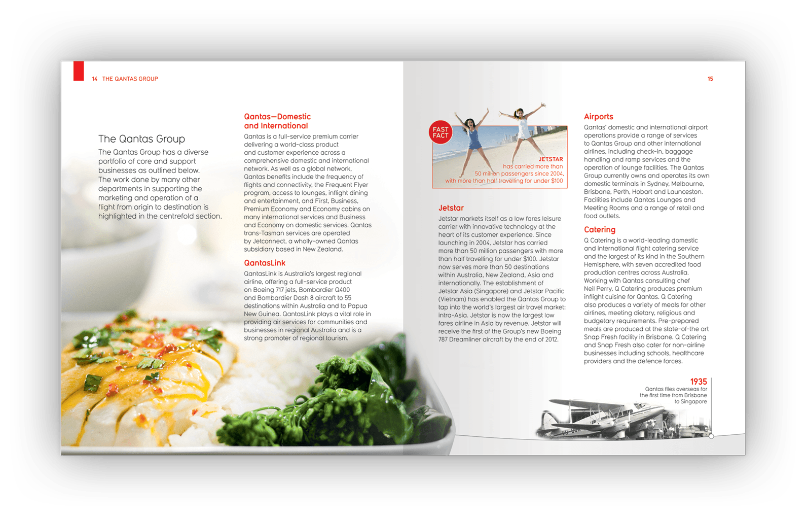
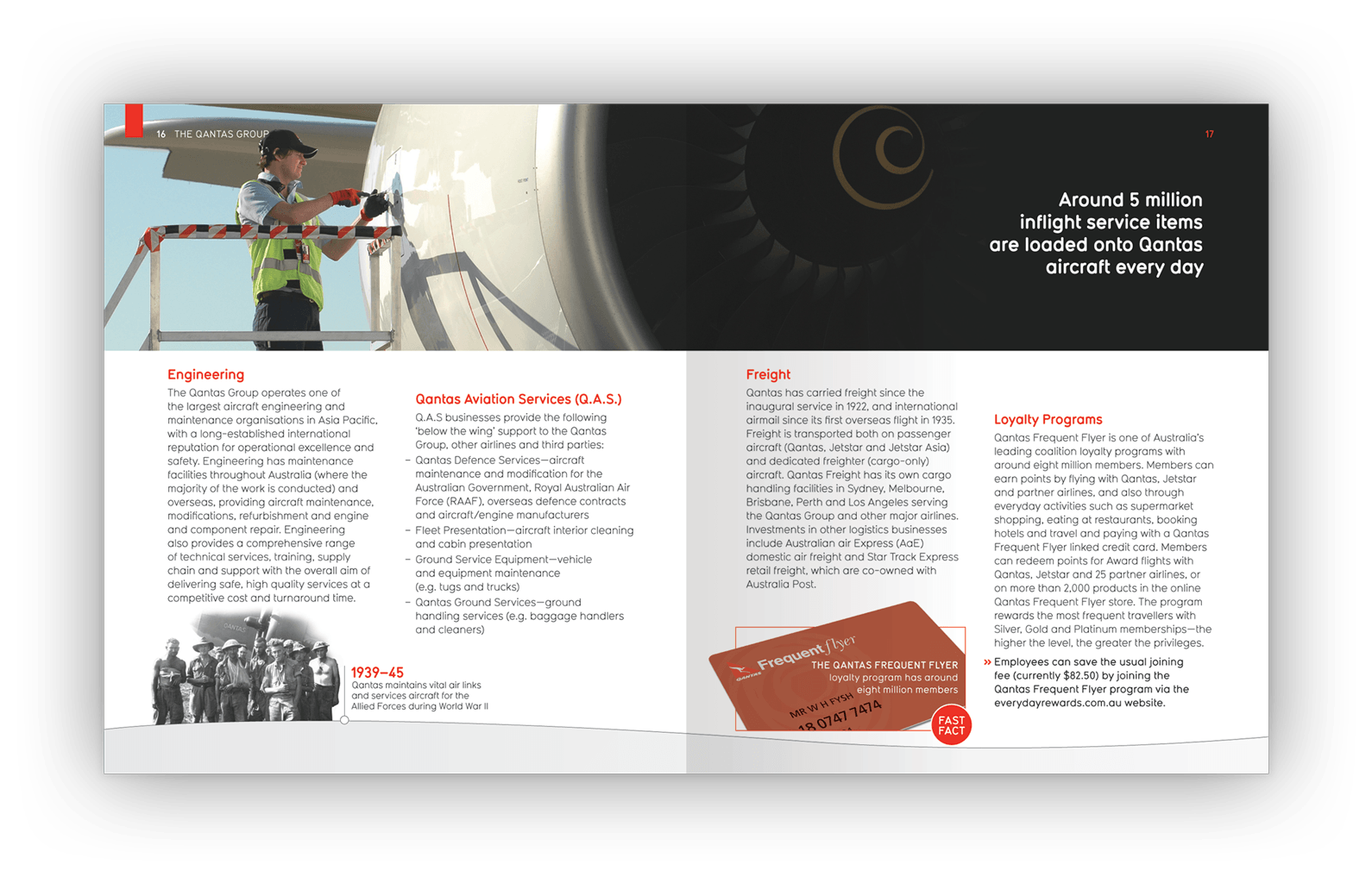
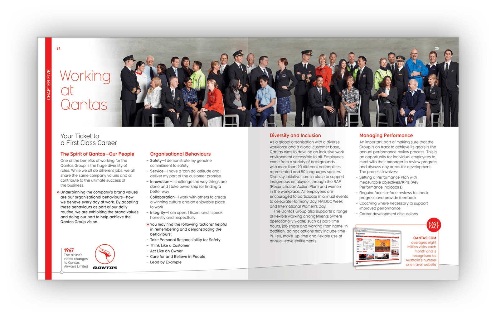
Above (and below): Qantas’s story included well known consumer facing businesses like Jetstar, QantasLink, Freight and Loyalty, and lesser known support units like Engineering, Catering, Integrated Operations and Ground Services.
Client testimonial
“The [Little Red Book booklet design] looks fantastic — you have done a brilliant job. It is receiving rave reviews internally.”
Head of Engagement and Leadership, People, Performance and Culture (departmental head for employee-facing communications)
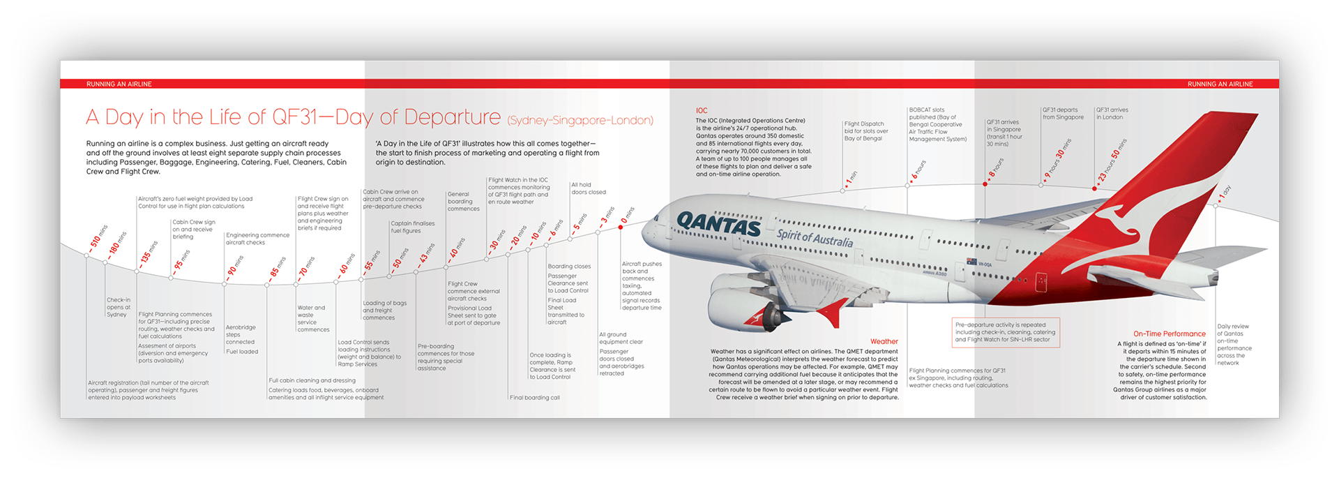
Above: An infographic article — designed over a four-page gate-fold — shows the timeline of a typical flight.
The story behind the design
Originally conceived as a welcome guidebook for new employees to assist their on-boarding process at Qantas, the value of the Little Red Book as a broader internal communication tool was recognised early.
Circulation was increased and it became an organisation-wide guidebook, distributed to all Qantas employees, to communicate, inform and entertain.
The guidebook design
Qantas had recently undergone a rebrand and was midway through the implementation of new Departures and Arrivals terminals at Sydney Airport.
Using the architectural renderings of baggage carousels, airport wayfinding signage, and basic branding guidelines, we were charged with developing the visual principles to this text-heavy printed publication.
The Little Red Book was the first internal communication piece published using Qantas’s new branding and, as a vehicle for communication, helped introduce the new brand to Qantas’s workforce.
Specifications
> 62-page printed booklet
> An intentionally irregular 165mm x 190mm size
> Small enough to keep handy and read
> Proportions help the booklet avoid being perceived as an A4-sized ‘corporate’ report
> Distributed to all employees across the Qantas Group.
Creative awards
Gold Award — Creativity Annual Awards
Silver Award — International Creative Media Awards.
Want to know more?
Contact James Armstrong for a chat about this project, your project, or a design quote.