Dividing line.
Design visual
The infographic design.
The story behind the design 
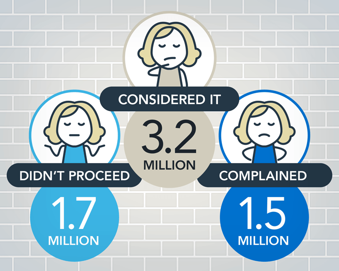
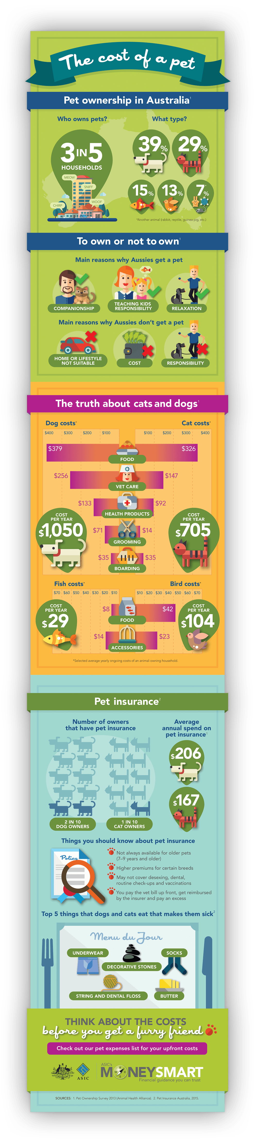
This infographic was one in a themed series about day-to-day financial literacy topics, published by the Australian Securities and Investments Commission’s Moneysmart (a website that helps ordinary Australians take steps to improve their personal finances and make the most of their money). 
Its long, vertical format was designed to suit use/scrolling on websites and other electronic devices, and for sharing on social media feeds.  
The infographic design 
The infographic’s look-and-feel echoed previously designed infographics, to give the impression that all infographics were part of a campaign. 
Creatively, an infographic can exploit duality by playing on how data is perceived differently. For example, the icons designed for ‘Relaxation’ (a great reason for getting a pet) and ‘Responsibility’ (a drawback) are identical.
Humour often enhances how information is digested — a point we demonstrated literally by grouping weirdly edible items into a Menu du Jour for pets.
Specifications 
> One infographics designed, in three sections to allow for staged release
> Final images optimised for use online and in social media. 
Creative awards 
Honorable Mention — International Design Awards 
Award of Excellence — Communicator Awards 
Silver Award — Daveys Awards 
Silver Award — Creativity Annual Awards. 
Want to know more?
Contact James Armstrong for a chat about this project, your project, or a design quote. 

View another design project

Suite of brochures for designer products
These brochures were a balancing act between aspirational imagery and a need for detailed technical information.
Dispute resolution infographic design
This infographic is helping the regulator help financial services firms develop better dispute resolutions for consumers.
Label designs for water range
With a complex proposition to communicate, this water also needed a unique design to stand out in a cluttered category.
Label designs for wine range
Each label is an illustrative chapter in the winemaker’s story, celebrating each milestone with tongue-in-cheek humour.
Newspaper design for Qantas employees
A five-year contract designing the monthly editorial for ‘Qantas News’: Qantas’s flagship newspaper for employees.
Annual report design for government
How do you portray health complaints as something positive? As this annual report design demonstrated: quite happily.
Guidebook design for Qantas employees
Qantas’s impressive brand story, history, culture and values feature in this handy guidebook for employees.
Booklet design for Tourism Australia
How do you market Australia to the world? This booklet design introduced ambassadors and influencers to our nation’s brand.
Newsletter design for Qantas employees
This newsletter had to follow restrictive internal brand guidelines yet still achieved visual distinctiveness for the unit.
Textbook design and company promotion
A clever design merged this company’s marketing promotion and coursework textbook into a single solution.