Dividing line.
Design visual
The infographic design.
The story behind the design 
The Behavioural Research and Policy Unit at the Australian Securities and Investments Commission conducted extensive consumer research about the complaints handling processes at financial services firms.
We were tasked to communicate this visually, as two infographics, to promote the launch of ASIC’s accompanying research report. 
The infographic design 
This infographic was an interesting design challenge because of the volume of data available to communicate, and the complex or nuanced relationships between some datasets. 
We consulted with ASIC to help prioritise what ‘hero data’ would be published, ensuring the infographic could remain a manageable size and visually engaging. 
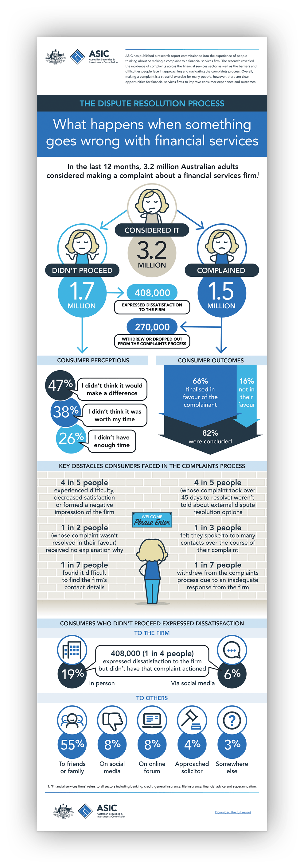
A fun motif, that helped tied information together, was the stylised human affectionately known as ‘Jan’ (short for ’not happy, Jan’). Jan was a decorative element that helped break up the facts and figures, bring humour and visual interest to the drier sections, and remind viewers who the focus of the report is: consumers.  
The second infographic will be posted here once ASIC publishes it. 
Specifications 
> Two infographics designed
> Used online and in social media. 
Want to know more? 
Contact James Armstrong for a chat about this project, your project, or a design quote. 

View another design project

Suite of brochures for designer products
These brochures were a balancing act between aspirational imagery and a need for detailed technical information.
Booklet design for Tourism Australia
How do you market Australia to the world? This booklet design introduced ambassadors and influencers to our nation’s brand.
Label designs for wine range
Each label is an illustrative chapter in the winemaker’s story, celebrating each milestone with tongue-in-cheek humour.
Newsletter design for Qantas employees
This newsletter had to follow restrictive internal brand guidelines yet still achieved visual distinctiveness for the unit.
Textbook design and company promotion
A clever design merged this company’s marketing promotion and coursework textbook into a single solution.
Newspaper design for Qantas employees
A five-year contract designing the monthly editorial for ‘Qantas News’: Qantas’s flagship newspaper for employees.
Label designs for water range
With a complex proposition to communicate, this water also needed a unique design to stand out in a cluttered category.
Product launch campaign for Qantas
Workplace changes can be hard. This awareness campaign emphasised the benefits for workers, not the corporation.
Financial literacy infographic design
An entertaining insight into the financial strains that Fido and Felix can place upon pet-loving Australians.
Annual report design for government
How do you portray health complaints as something positive? As this annual report design demonstrated: quite happily.