Design visuals

Above (and following): Each poster is a testimonial, spoken by a hypothetical WebRoster user, explaining how the system benefitted their unique needs. Headlines are intentionally intriguing to grab attention.

Client testimonial
“I highly recommend [James Armstrong]. I’ve worked with James on numerous graphic design projects and found him to be very talented, helpful, responsive, willing to work to budget and delivers accurately to briefs. The added bonus with James is you get more than just a regular graphic designer. He has a real ‘advertising flair’ and so brings a different level of creative to his work. He has often exceeded my expectations.”
Internal Communication Manager (project manager for WebRoster)
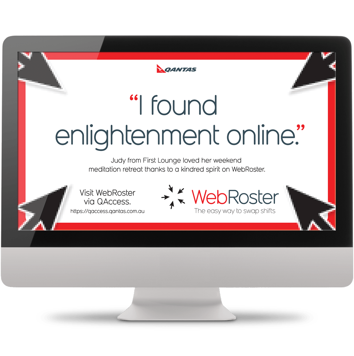
Above: Each printed poster was also adapted to digital formats.

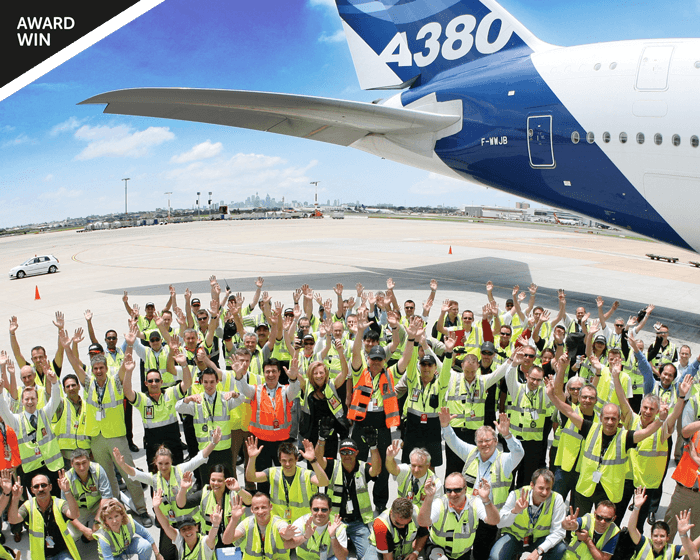
Above: Employees at Qantas Ground Operations include those working within baggage handling services loading the aircraft.
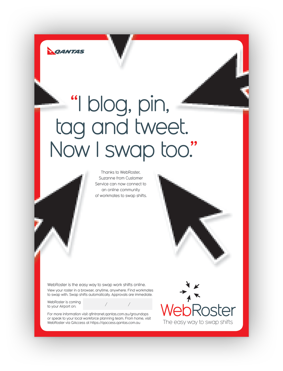
Above: Some welcome satire at a time when everyone was embracing new social media platforms, trends and online vernacular.
The story behind the design
The Ground Operations business unit at Qantas is a large workforce, largely airside-based (not office-bound).
For decades, employee rostering was paper-based. Changing availability, or miscommunications, were resolved by a cumbersome, outdated, form-dominated system, requiring approvals from middle managers.
WebRoster — a new employee rostering software — promised to solve all this. Accessible via a browser, employees could connect with other staff and mutually agree to swap their shifts (resolving both individuals’ availability and the business unit’s staffing capacity).
The problem to overcome at Qantas — and an issue faced by many larger companies with legacy systems — was employees’ resistance to workplace change and mistrust of new technology that could threaten employment.
We were tasked with introducing the WebRoster concept, overcoming bastions of resistance, and educating about its use via an awareness and product launch campaign.
The product launch design
creative idea
This campaign explored an interesting contrast.
Visually, the branding (Qantas’s brand red and typography) followed corporate style. But verbally, the voice of the campaign is written from the perspective of employees’.
Each execution is a testimonial — spoken by a hypothetical user of WebRoster — explaining how the new system benefitted that user’s needs.
Each testimonial was a fun (sometimes quirky) insight into the humanity of Qantas’s workforce, acknowledging their unique interests, and validating their desire to manage their time in a non-judgemental way.
This positioned WebRoster as a tool to manage work-life balance (not as an efficiency initiative from upper management). It created trust and sped the rate of adoption.
Logo
Five arrow-cursors symbolise different employees coming together to use the web-based interface to engage with each other and swap work shifts.

Specifications
> Five A1 printed posters for the workplace
> Five digital posters for employee emails
> Employee package (containing WebRoster users guide) and fridge magnets with URLs (for easy reference by employees at home).
Creative awards
Honorable Mention — Creativity Annual Awards.
Want to know more?
Contact James Armstrong for a chat about this project, your project, or a design quote.