Dividing line.
Design visuals 
Three water bottles, side-by-side, showing the water label designs.
Photograph of the three water bottles, side-by-side, showing the water label designs.

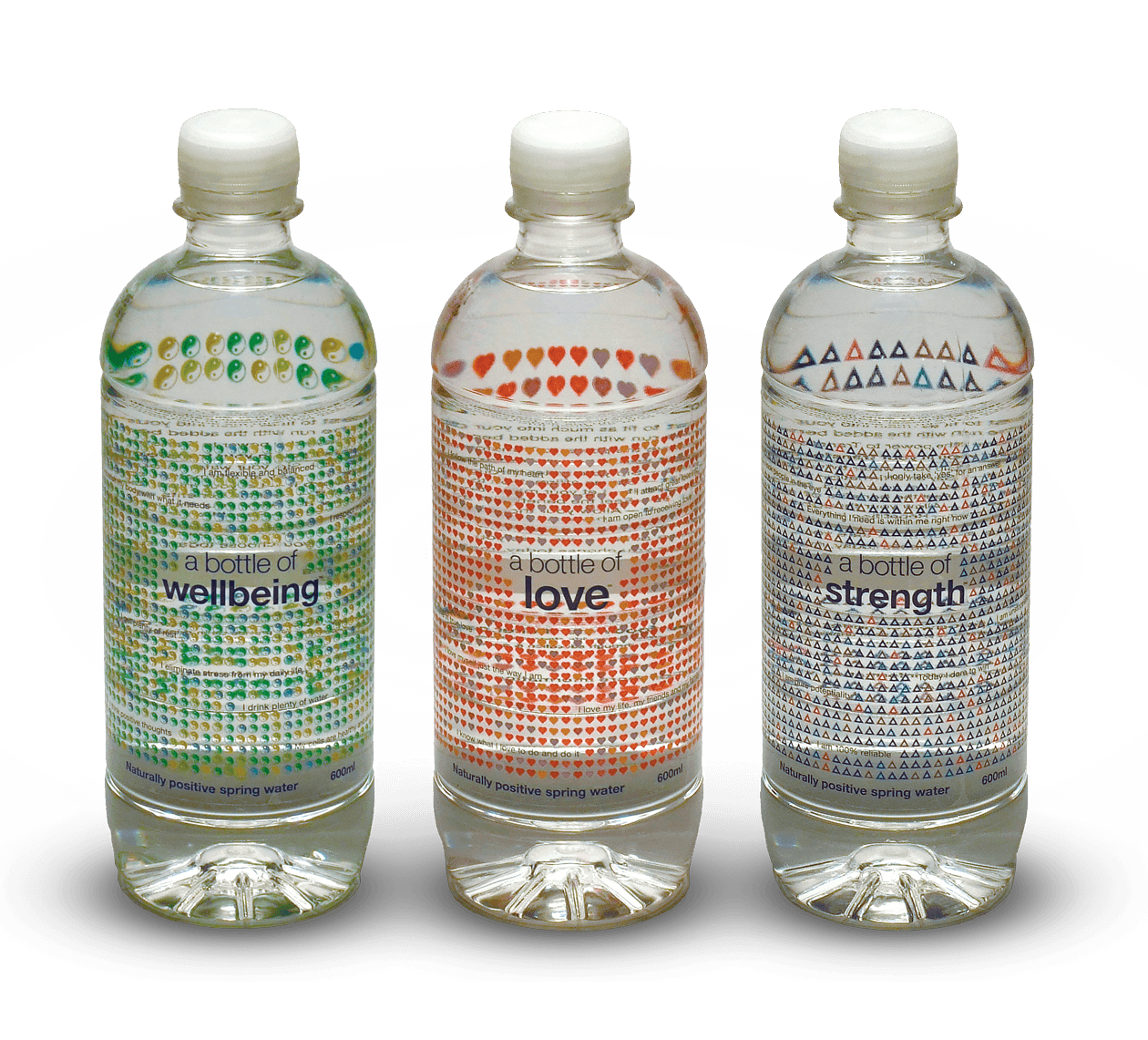
Above: The transparent label combined with the curved bottle shape to created a lensing effect that magnified the symbols.  

The flattened artwork of A Bottle Of Love showing front and back details.

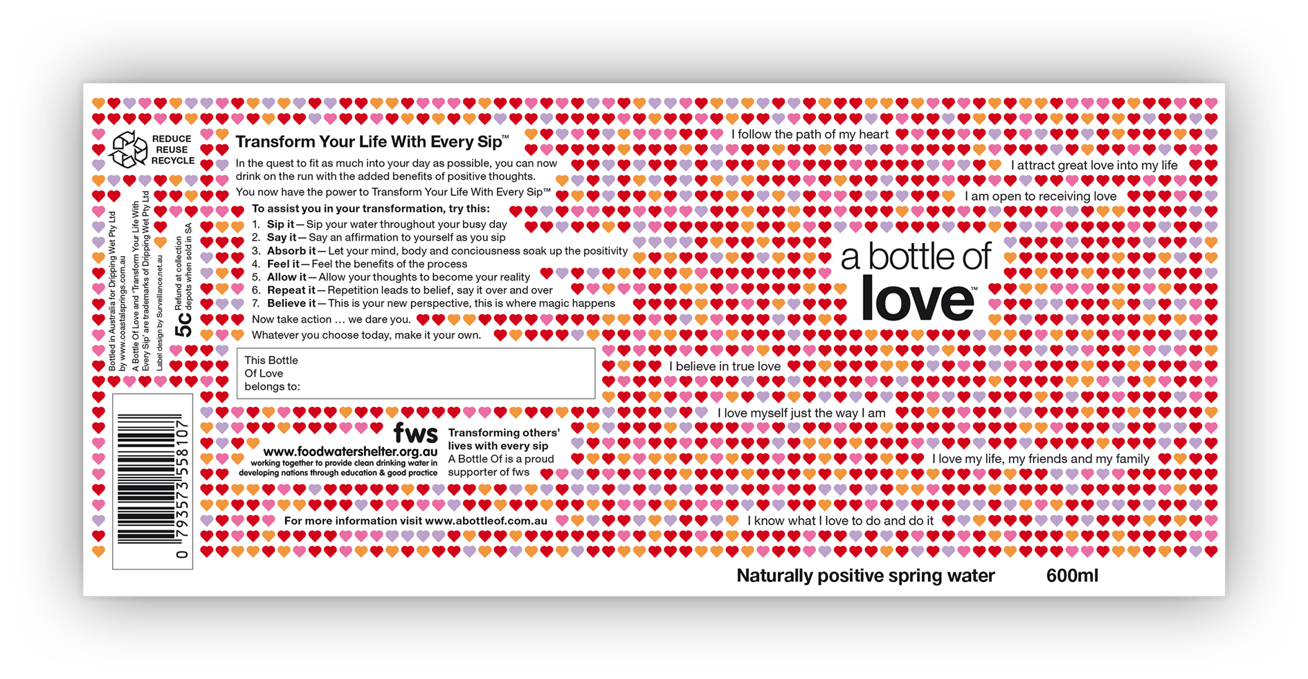
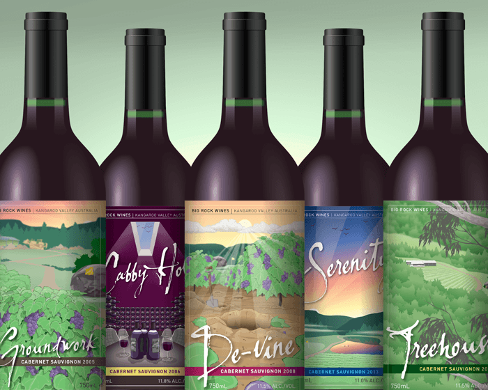
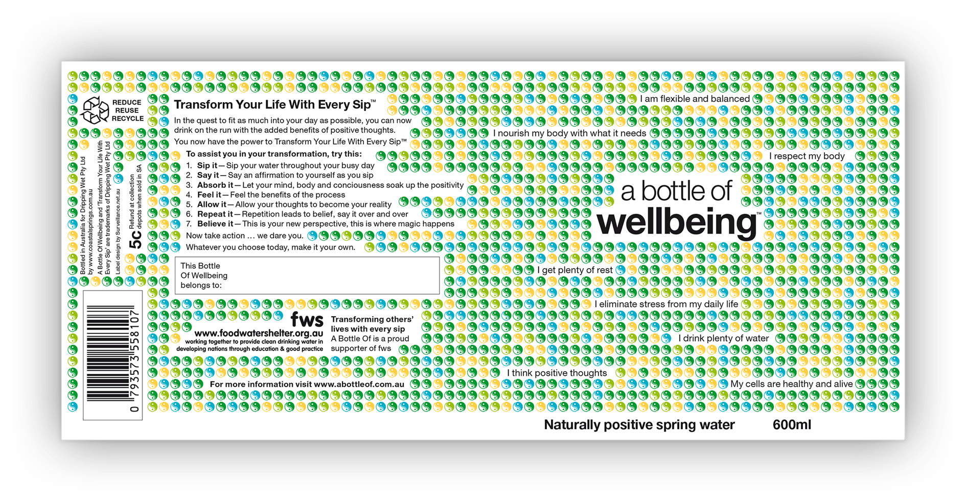
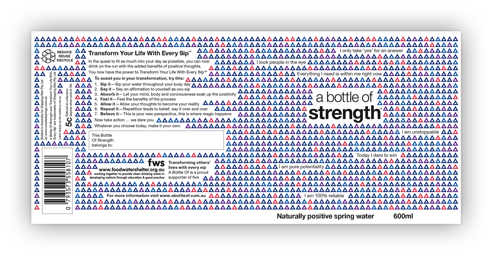
Above (and following): The full wrap-around artwork for each label design.

The flattened artwork of A Bottle Of Wellbeing showing front and back details.
The flattened artwork of A Bottle Of Strength showing front and back details.
The home page of the launch website.

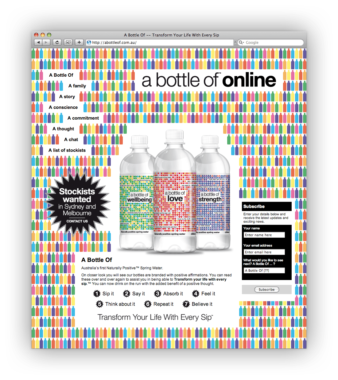
Above: The launch website.

The story behind the design 
At a time when the bottled water category was saturated with choices, this water range targeted an untapped market: belief in the metaphysical. 
While drinking, the purchaser was asked to recite positive affirmations from the label. The product’s intent was more than hydration; it was transformative.  
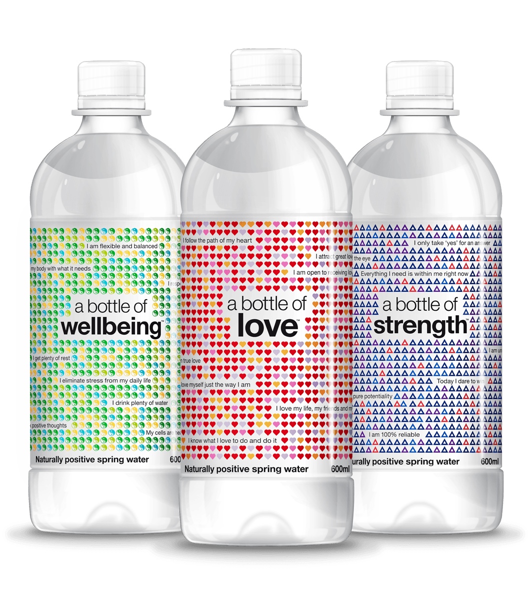
The initial launch consisted of three designs — Love, Wellbeing and Strength. As the product range grew, additional words and affirmations would be released.
The water label design
The label designs avoided stereotypical alternative lifestyle or yogic imagery (and accompanying negative perceptions) opting for a bold, contemporary, graphic design. 
Repetition of symbols and vibrant colours visually parallel the affirmations on each bottle that consumers are to recite.
At launch, an interim website design was created to explain the water range’s proposition, field media enquiries and source stockists. 
Specifications 
> Three wrap-around labels
> Launch website design
> Misc. business support items (e.g. packaging carton, stationery). 
Awards
Silver Award — Creativity Annual Awards.
Want to know more?
Contact James Armstrong for a chat about this project, your project, or a design quote. 

View another design project

Textbook design and company promotion
A clever design merged this company’s marketing promotion and coursework textbook into a single solution.
Product launch campaign for Qantas
Workplace changes can be hard. This awareness campaign emphasised the benefits for workers, not the corporation.
Newspaper design for Qantas employees
A five-year contract designing the monthly editorial for ‘Qantas News’: Qantas’s flagship newspaper for employees.
Label designs for wine range
Each label is an illustrative chapter in the winemaker’s story, celebrating each milestone with tongue-in-cheek humour.
Guidebook design for Qantas employees
Qantas’s impressive brand story, history, culture and values feature in this handy guidebook for employees.
Annual report design for government
How do you portray health complaints as something positive? As this annual report design demonstrated: quite happily.
Dispute resolution infographic design
This infographic is helping the regulator help financial services firms develop better dispute resolutions for consumers.
Suite of brochures for designer products
These brochures were a balancing act between aspirational imagery and a need for detailed technical information.
Booklet design for Tourism Australia
How do you market Australia to the world? This booklet design introduced ambassadors and influencers to our nation’s brand.
Financial literacy infographic design
An entertaining insight into the financial strains that Fido and Felix can place upon pet-loving Australians.