Design visuals
The annual report's cover design — a four-by-four grid containing consumer portraits and areas of colour.

Above: The cover is a grid of happy faces and a friendly colour palette — not the kind of content one might expect from a complaints handling organisation.  

Double-page layout design.
Double-page layout design showing a page with three large portraits and a pull-out quote from the text page opposite.

Above (and following): Each double-page spread uses a simple two-by-two grid, upbeat colours, and portraits of consumers experiencing the happy outcome that the Private Health Insurance Ombudsman provided. 

Double-page layout design showing the humorous size difference between the tallest of consumers, adjacent to a child.

Above: Though static, the grid layout of the consumer portraits often allowed for humorous compositions.  

Double-page layout design showing how tabular information was designed to suit the grid.

Above: As the annual report’s content varied, the underlying grid ensure a neat presentation.

Client testimonial 
“We have worked with [James Armstrong] on [seven] major publications over [four] years, including [three] Annual Reports. The result has been excellent each time, thanks to James’ collaborative approach, great communication skills, and design aesthetic. When potential problems have arisen, they’re always quickly addressed and resolved. Thanks to James, we’re confident each time that the final product will be high quality and that the process will go smoothly.” 
Senior Project and Policy Officer (project manager for annual reports) 
Double-page layout design.
Double-page layout design that makes a tongue-in-cheek visual link between the shape of a human head and the rounded form of a computer mouse.

Above: To continue the light-hearted tone, some portraits became playful (yet content-relevant) visual puns.   

Client testimonial 
“It’s been very painless and straight forward working on the [annual] report this year as usual, thanks from me and everyone at PHIO for making it so easy.” 
Senior Project and Policy Officer (project manager for annual reports) 
Double-page layout design showing the design's application to bar and pie charts.
Double-page layout design.
Double-page layout design for the financials pages.

Above: Financial pages are often visually neglected within an annual report — but not in this case. 
The story behind the design 
As a complaints-handling organisation, the Private Health Insurance Ombudsman (PHIO) dealt with distressed consumers experiencing poor health support. 
Yet there was a truth to explore: positive change. 
We shifted attention away from the unpleasant process and onto the outcome: happy resolutions. 
This was expressed as a simple before and after image:       
A before-and-after image of an unhappy consumer (before PHIO) next to the same now-happy consumer (after PHIO).
The happy consumer became the motif for the annual report design. 
That motif became the conceptual foundation for three consecutive annual reports from 2012 to 2015.
The annual report design 
Consumer portraits 
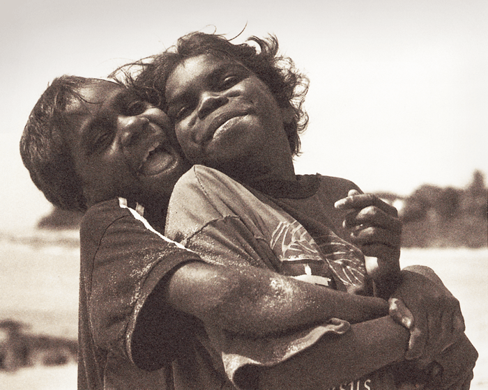
Portraits mirrored the diversity of the Australian population — age, gender, race — and allowed for moments of humour and contrast. 
Each portrait is visually separated from others around it on the page, communicating that each consumer’s story is distinct.
The grid 
A four-by-four grid (on covers) and two-by-two grid (editorial pages) dominate the annual report’s design. 
This rigid structure helped counterbalance the warm tone and humanity created by the consumer portraits; a visual device to reminds us of the serious role PHIO plays.
Specifications 
> 94-page printed annual report
> B5 size (a special size used by the Australian Government) 
> Online WCAG-compliant accessible PDF
> Annual report fulfilled the statutory reporting requirements as well as an organisational marketing role. 
Want to know more? 
Contact James Armstrong for a chat about this project, your project, or a design quote. 
Photography credits: Joan Vicent Cantó Roig, Fred Froese, Mercè Bellera, Amanda Rohde, Ni Qin, Adam Kazmierski, Juanmonino, Ugurhan Betin and Zurijeta.

View another design project

Product launch campaign for Qantas
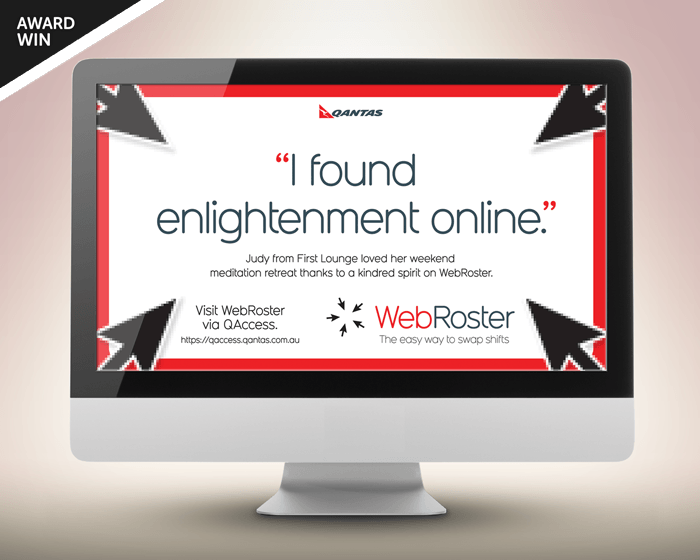
Workplace changes can be hard. This awareness campaign emphasised the benefits for workers, not the corporation.
Guidebook design for Qantas employees
Qantas’s impressive brand story, history, culture and values feature in this handy guidebook for employees.
Label designs for water range
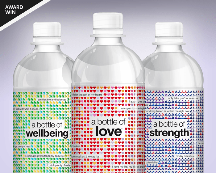
With a complex proposition to communicate, this water also needed a unique design to stand out in a cluttered category.
Financial literacy infographic design
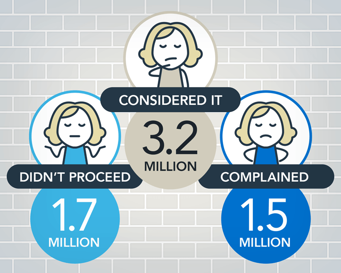
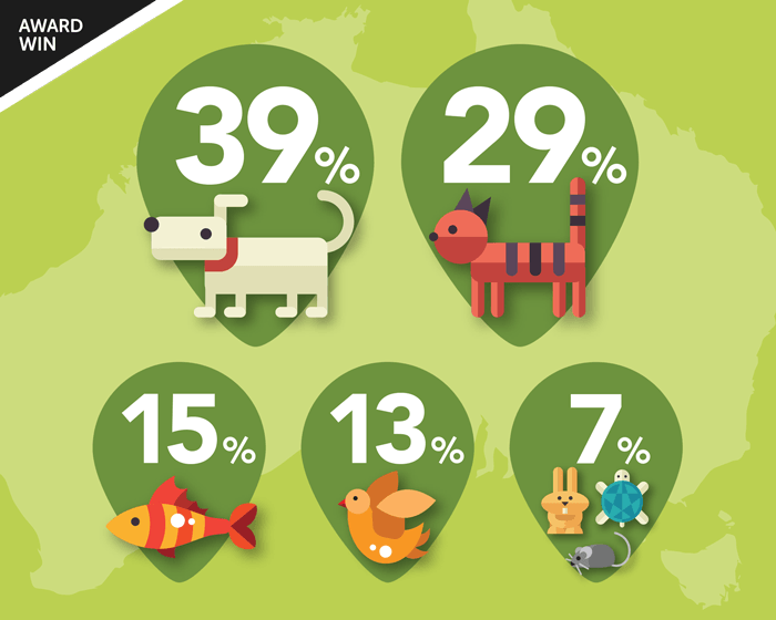
An entertaining insight into the financial strains that Fido and Felix can place upon pet-loving Australians.
Newspaper design for Qantas employees
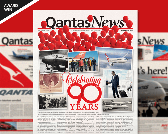
A five-year contract designing the monthly editorial for ‘Qantas News’: Qantas’s flagship newspaper for employees.
Newsletter design for Qantas employees
This newsletter had to follow restrictive internal brand guidelines yet still achieved visual distinctiveness for the unit.
Suite of brochures for designer products
These brochures were a balancing act between aspirational imagery and a need for detailed technical information.
Booklet design for Tourism Australia
How do you market Australia to the world? This booklet design introduced ambassadors and influencers to our nation’s brand.
Textbook design and company promotion
A clever design merged this company’s marketing promotion and coursework textbook into a single solution.
Label designs for wine range
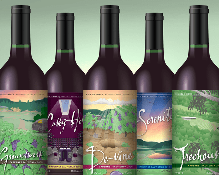
Each label is an illustrative chapter in the winemaker’s story, celebrating each milestone with tongue-in-cheek humour.