Design visuals
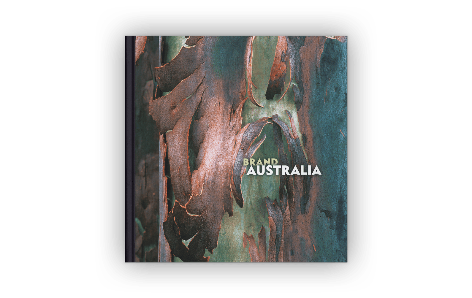
Above: The booklet’s hard-cover design.
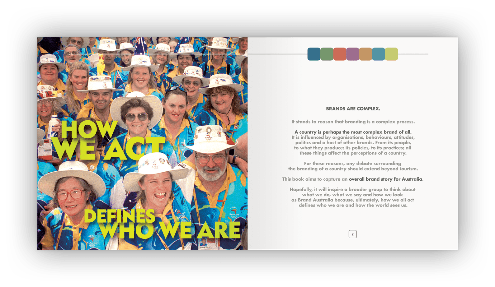
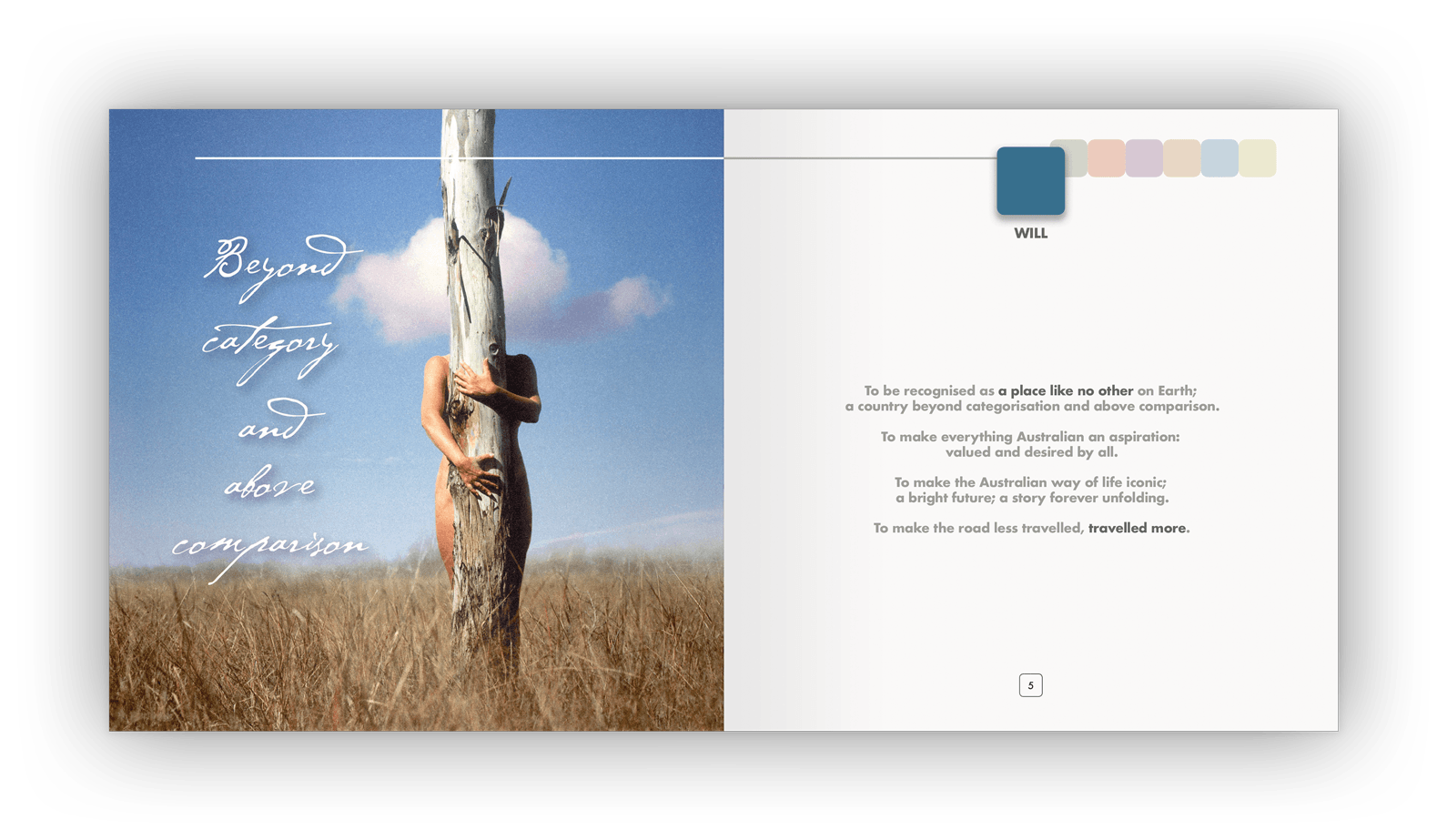
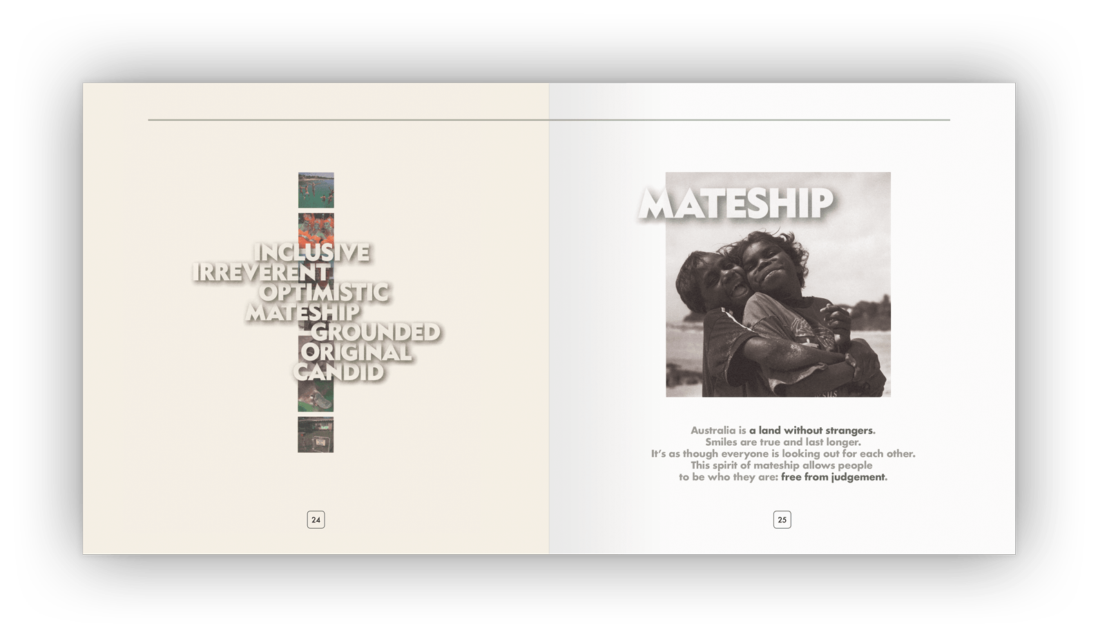
Above (and following): A qualitative statement introduces each tenet, expressed visually using evocative typography and imagery.
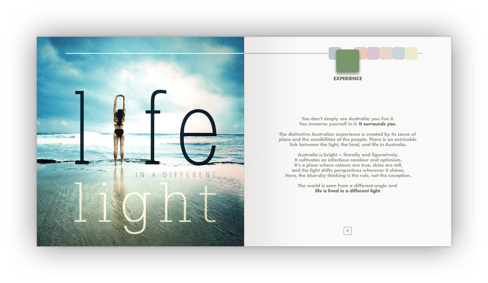
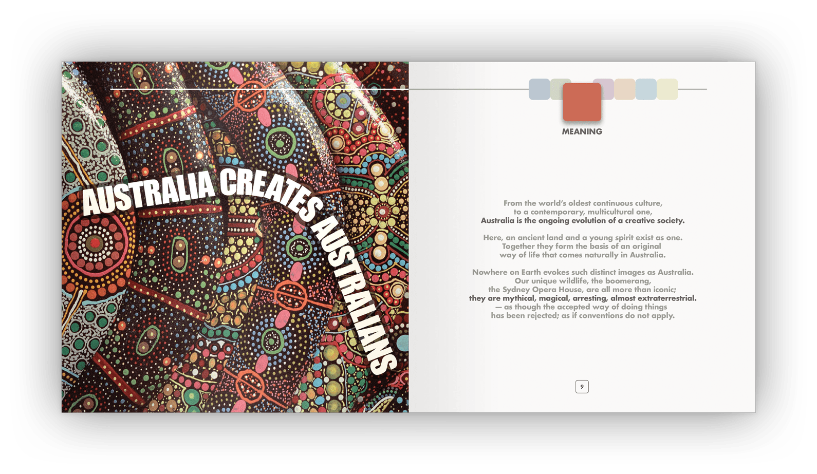
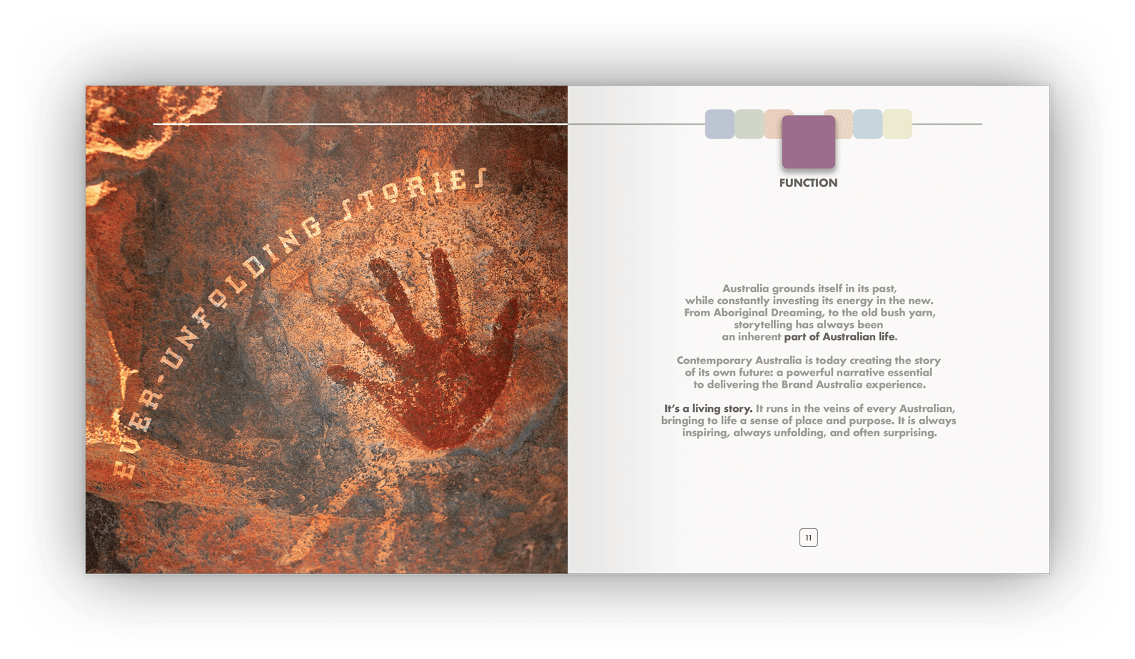
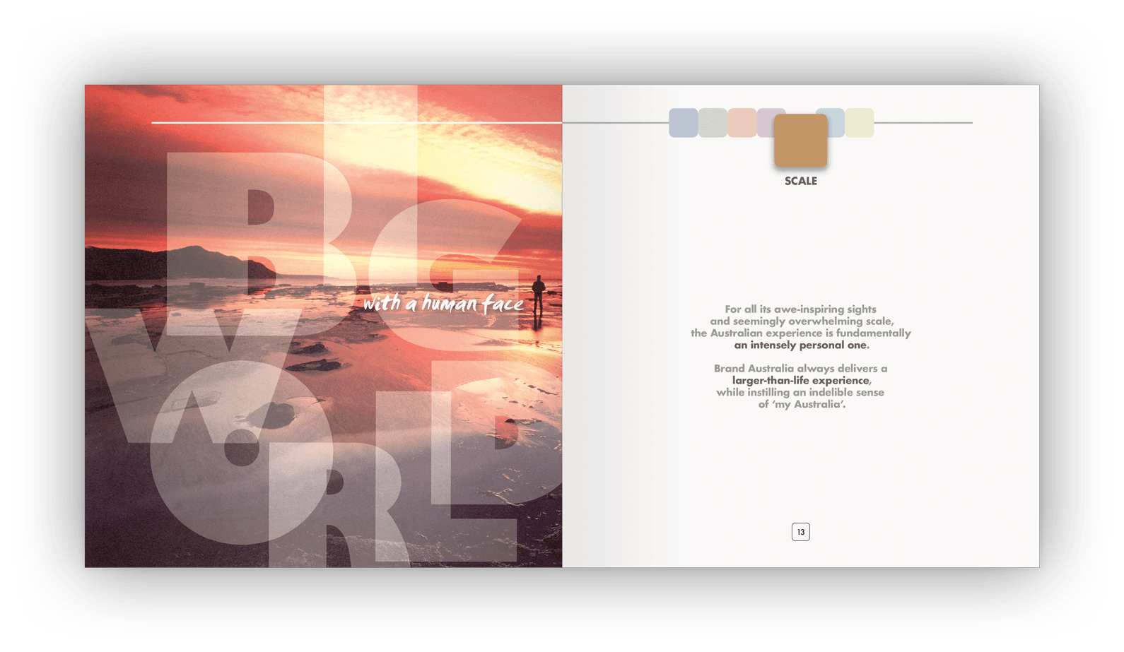
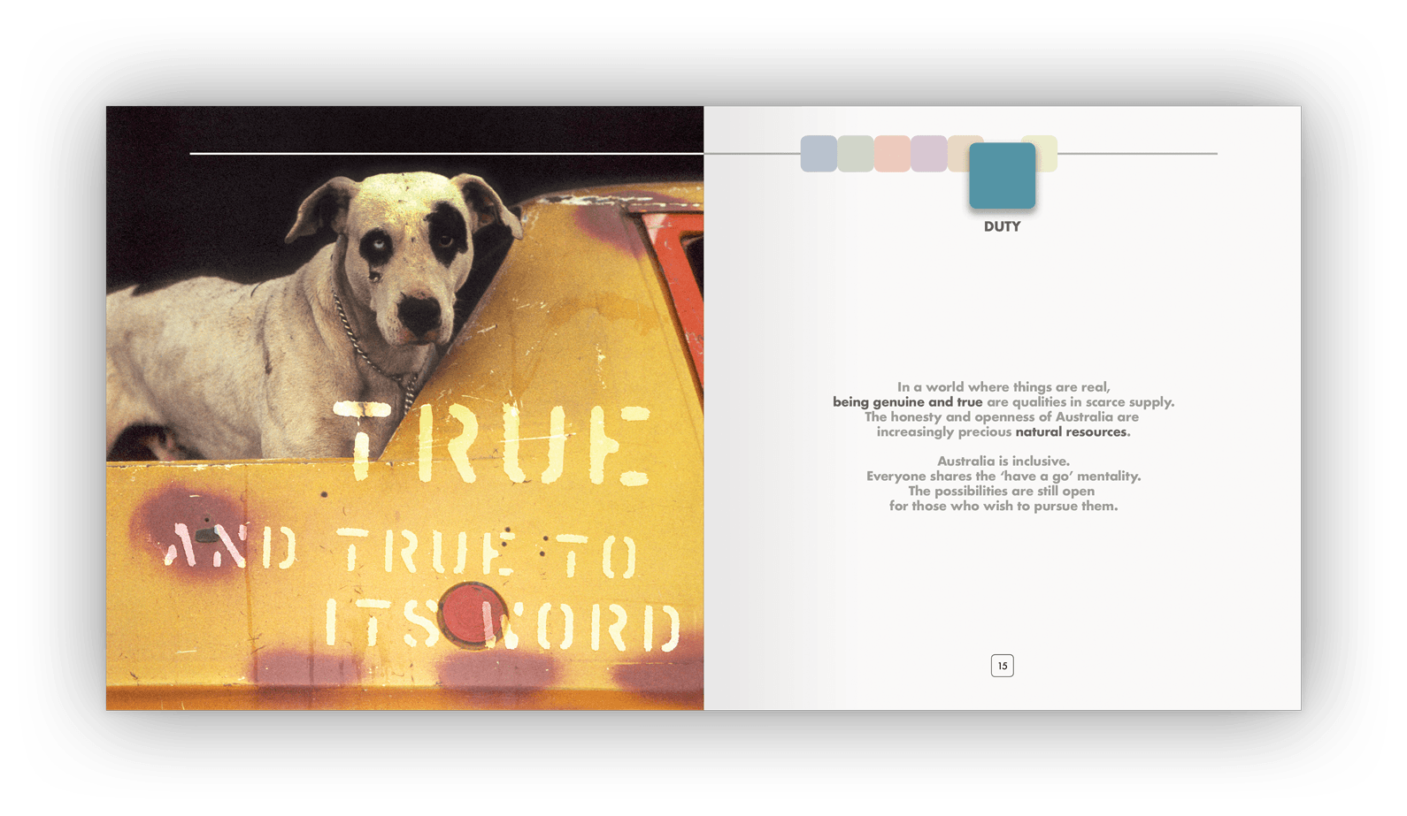
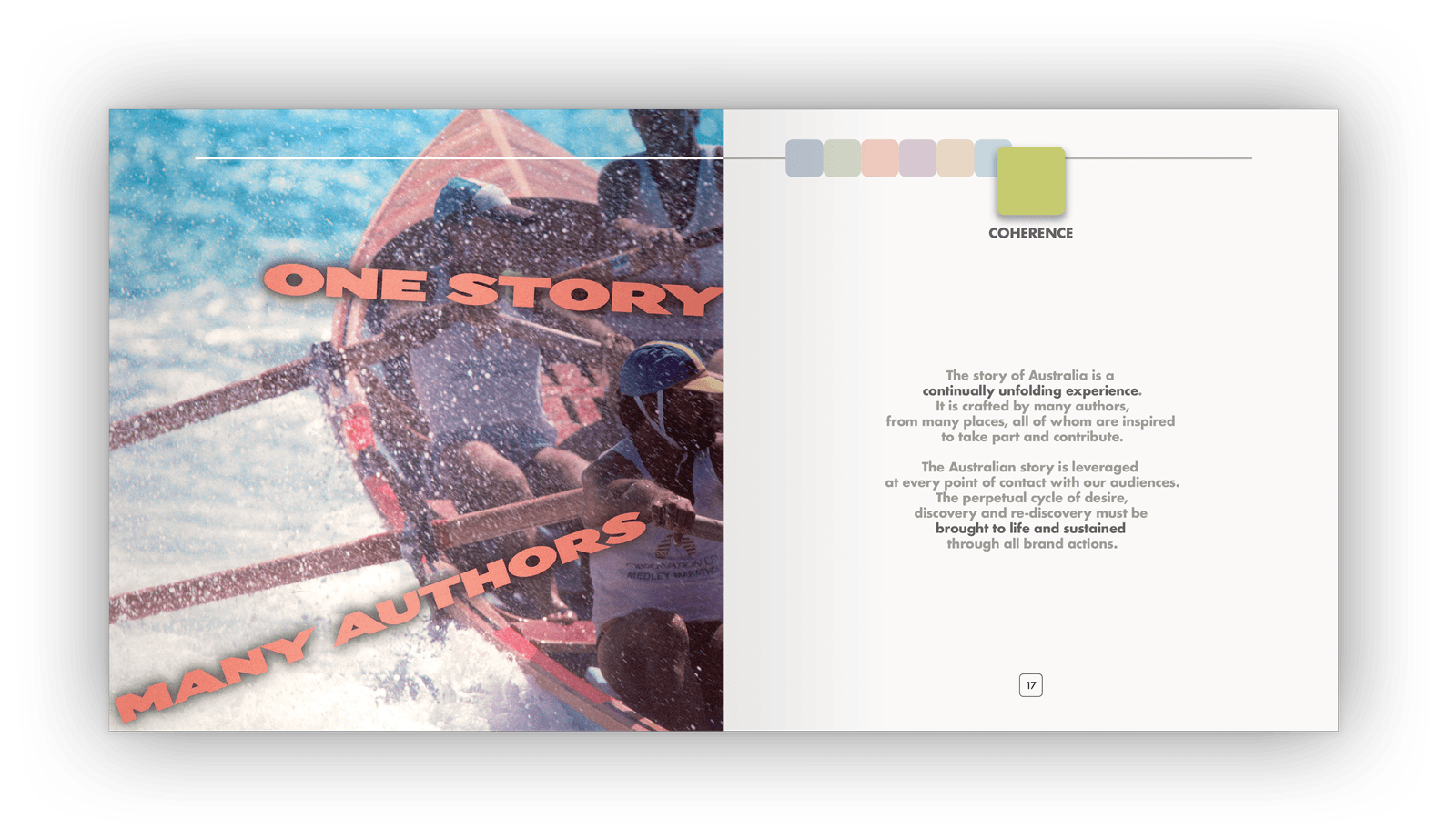
Above: Typography sometimes compliments, sometimes contrasts, and sometimes becomes part of the image.
The story behind the design
Tourism Australia is the Australian Government agency responsible for attracting international visitors to Australia by making Australia a desirable and memorable destination.
Like any marketing activity, understanding the product, and branding it effectively, was a critical responsibility. The only difference was scale: this time, the ”product” was the entire country.
Brand Australia was the term used by Tourism Australia for the development, articulation and early marketing of Australia’s brand (known now as Australia’s Nation Brand).
Brand Australia began humbly. It first saw light as a Powerpoint presentation, at internal and stakeholder meetings, to facilitate branding discussions. As the brand was formalised, it became clear that projector slides were not an appropriate vehicle to launch the nation’s brand and stimulate those charged with promoting it.
James Armstrong was engaged by Tourism Australia’s rostered agency, Whybin TBWA, to design a very special, hardback gift booklet — in effect, a hard-copy version of the Powerpoint presentation — which was given to key Australians with influence on the world stage (influential individuals, brand ambassadors, industry leaders, celebrities, and other social influencers).
The booklet design
The booklet conceptually challenges what being ‘Australian’ means, exploring what perceptions of Australia are, and distilling these down to seven brand tenets.
The design visually expressed each tenet in an evocative way, using bold imagery and typography as feature pages.
Specifications
> A 28-page printed hardback booklet
> Irregular 210mm x 210mm size.
Want to know more?
Contact James Armstrong for a chat about this project, your project, or a design quote.