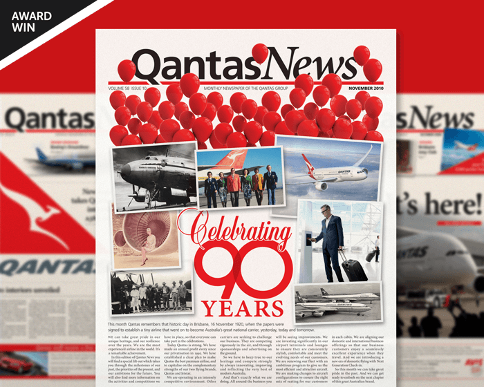
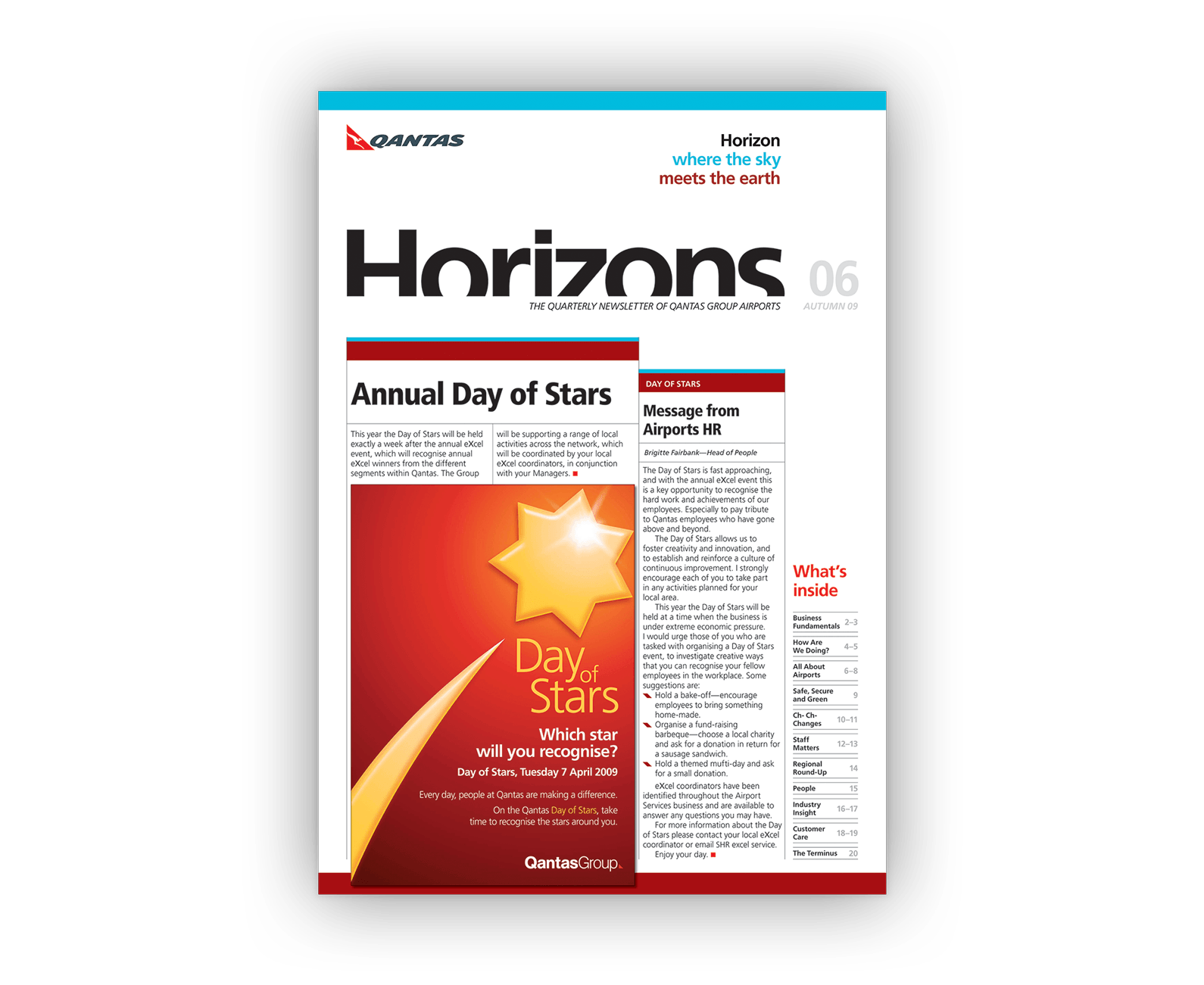
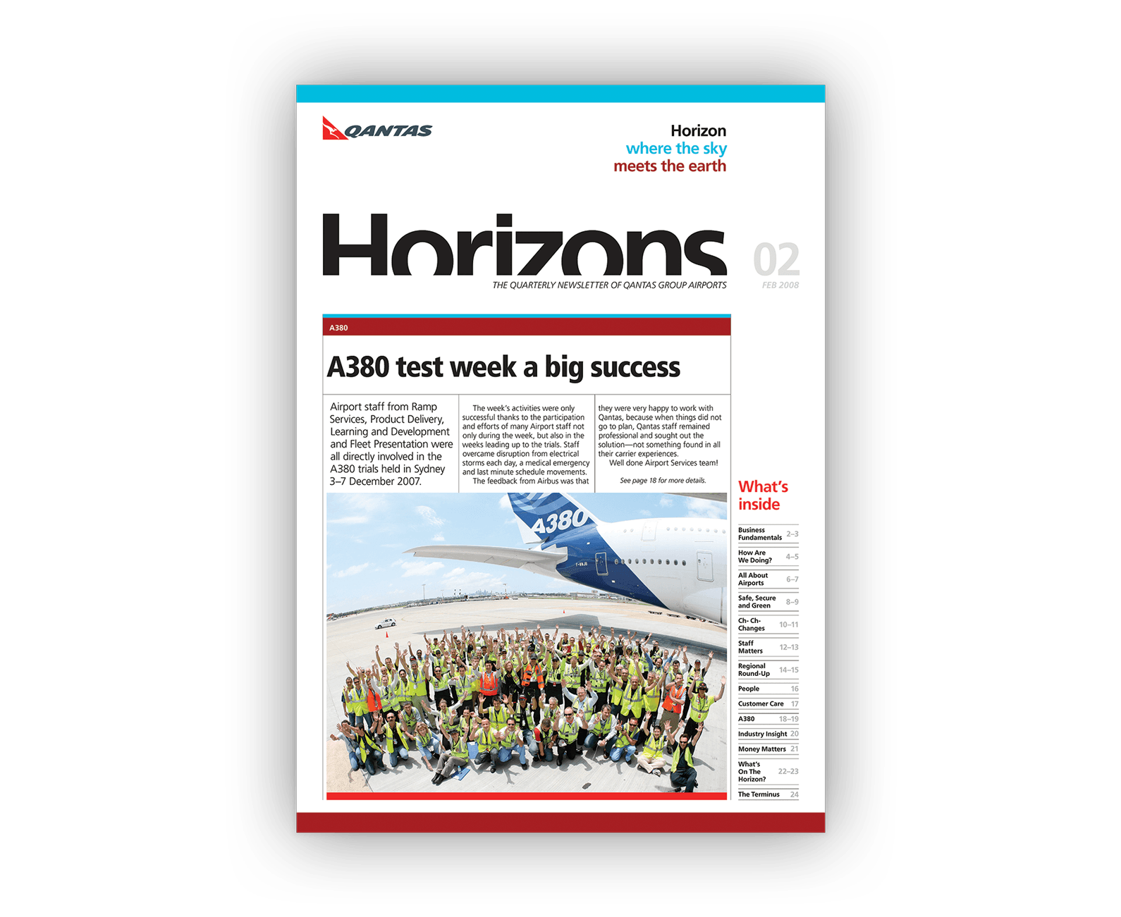
Design visuals
Above (and following): Some cover designs from selected newsletters.
Client testimonial
“I have no hesitation in recommending [James Armstrong’s] design agency. I have always found them to be excellent on all the projects I have worked with them on — high quality creative work, attention to detail, excellent customer service, always prioritised work, very transparent pricing and always delivered great value for money.”
Manager Workforce Communication (project manager for Little Red Book and Horizons newsletter)
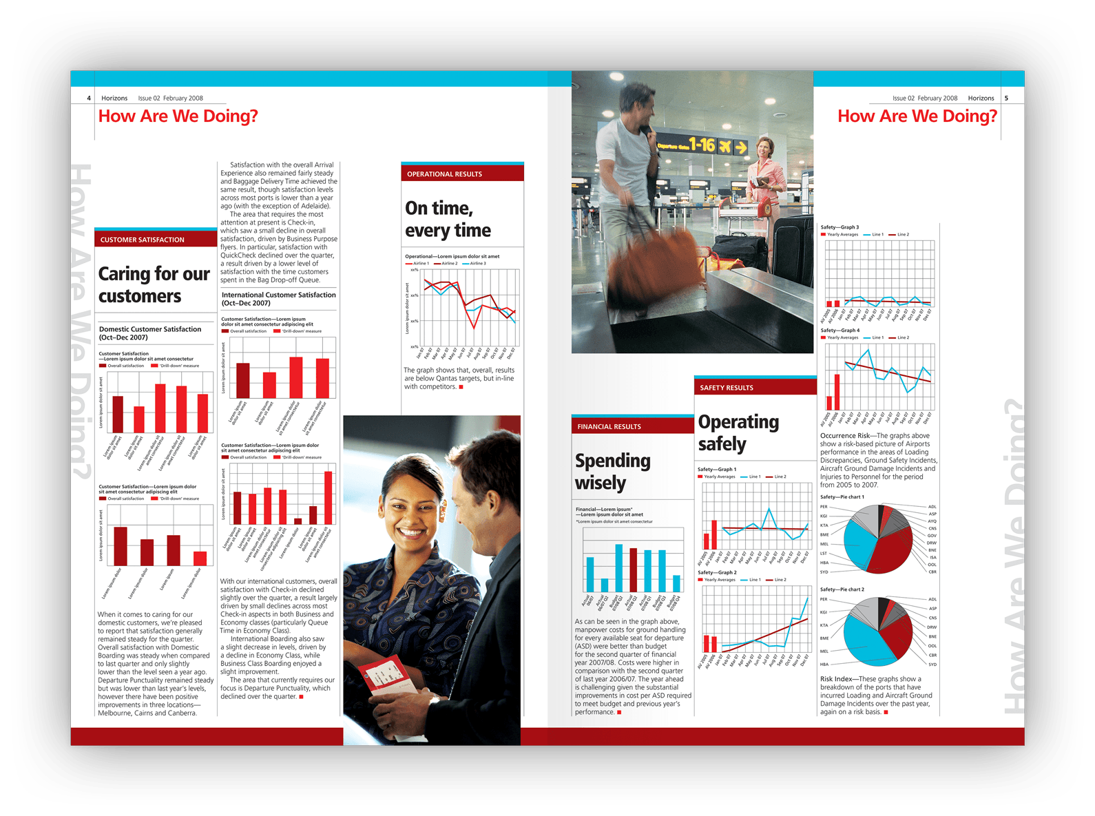
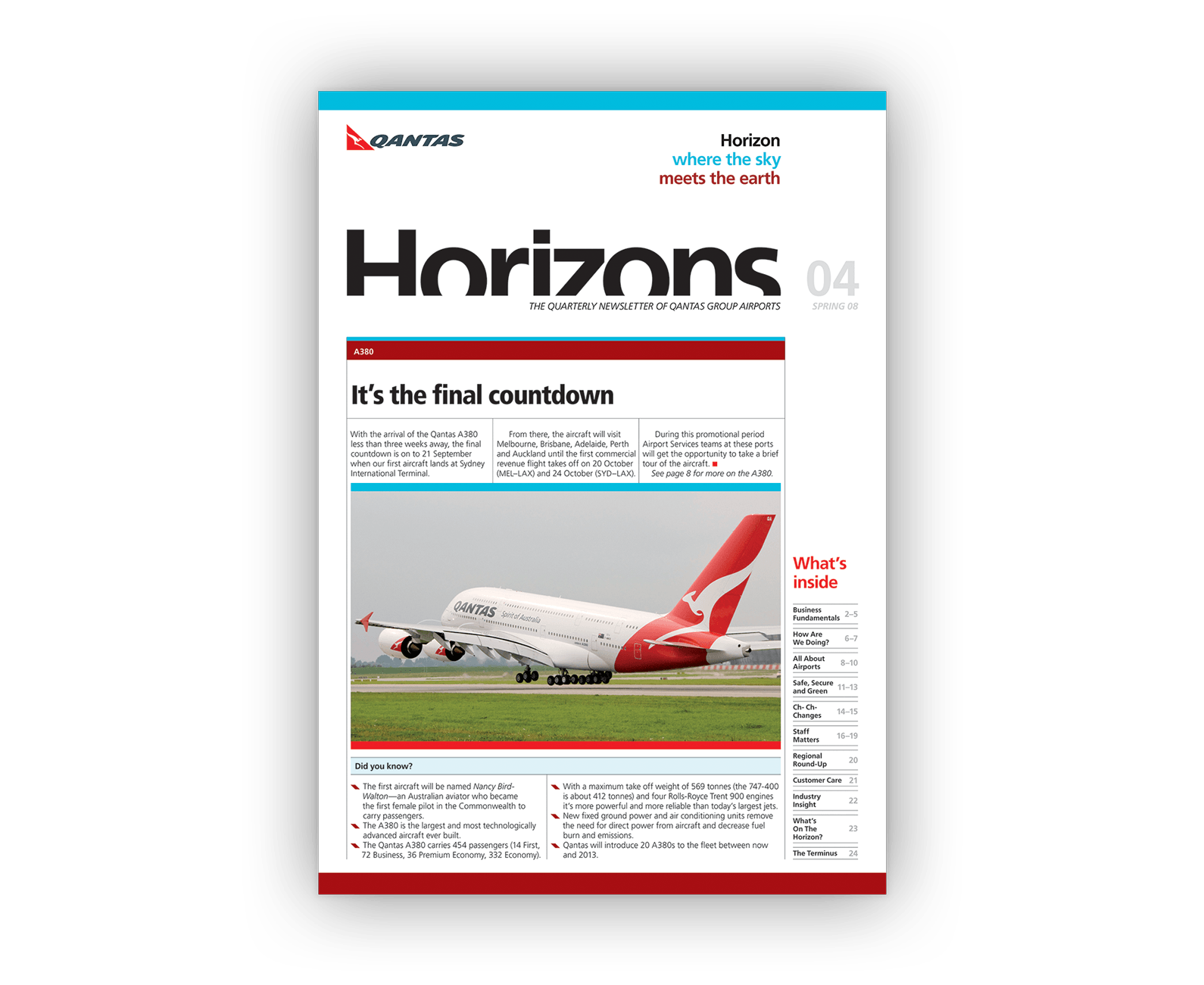
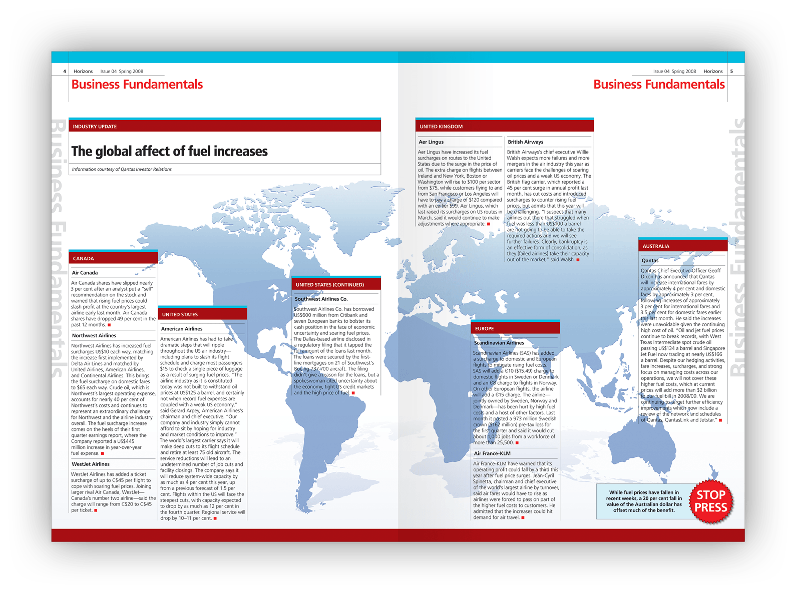
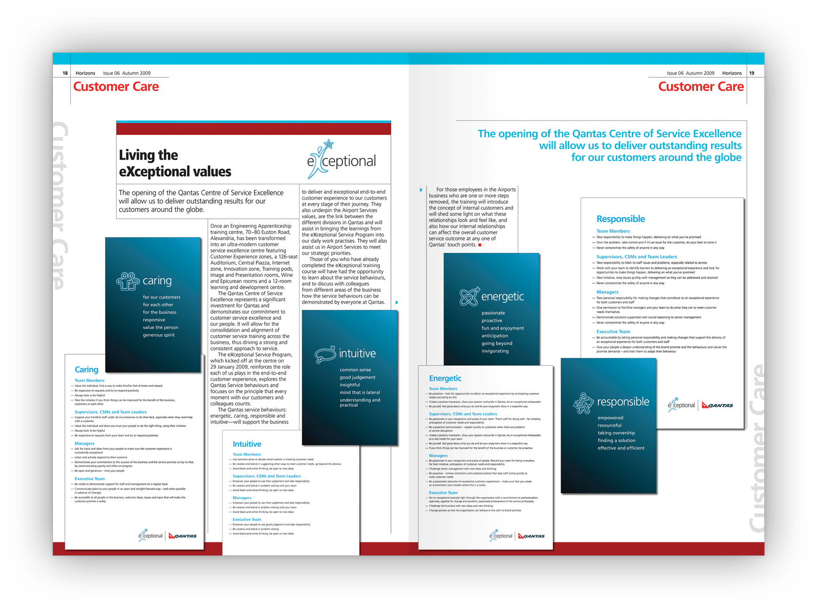
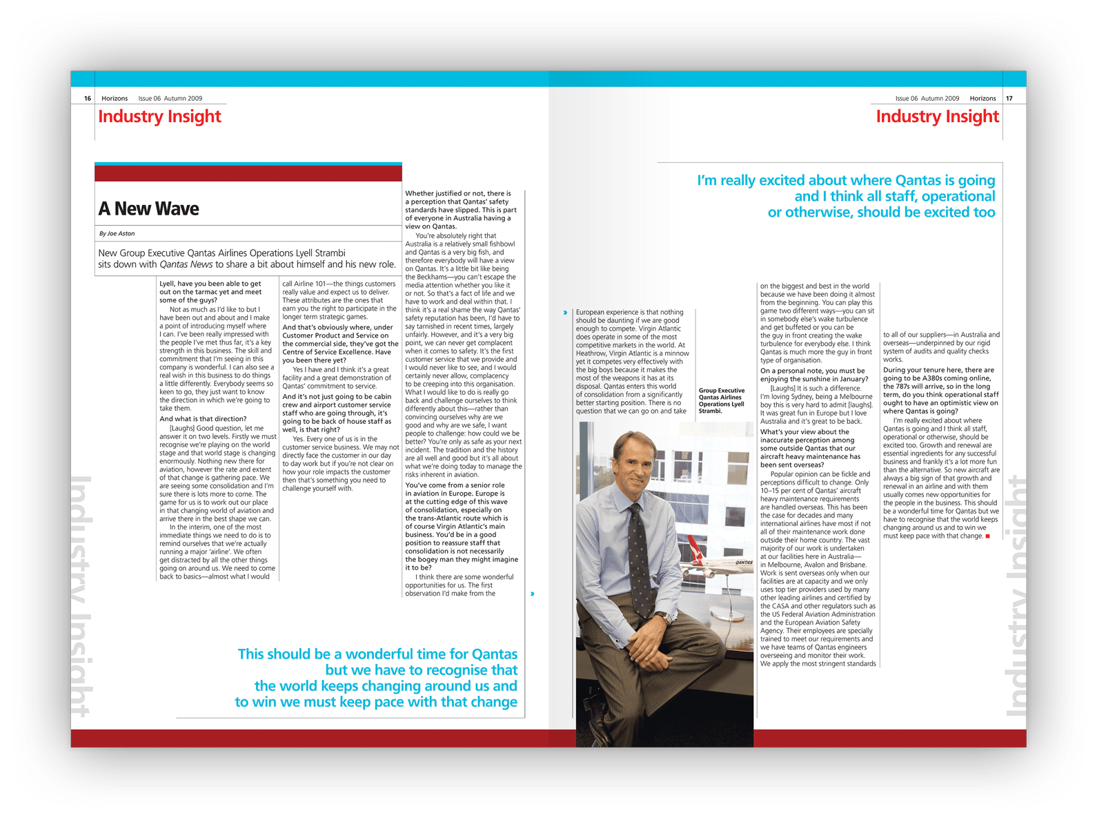
Above (and following): The editorial design followed a seven-column grid which accommodated a variety of content.
The story behind the design
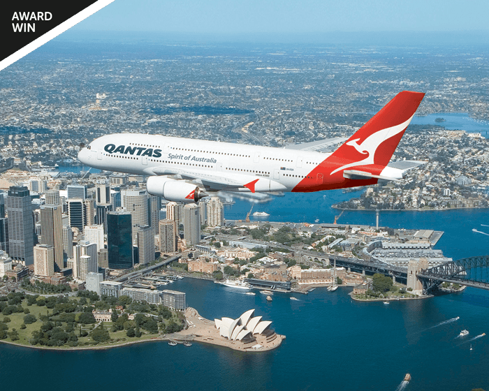
Qantas is a large organisation. The volume and reach of employee/internal communications produced by Qantas rivals the audience size of many consumer brands.
To distinguish employee communications from consumer-facing material, distinct internal communications brand guidelines are used.
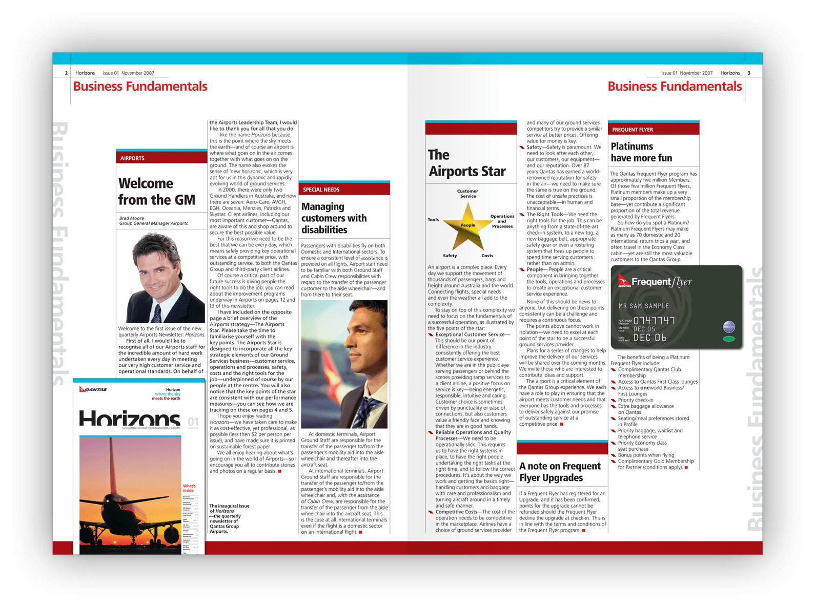
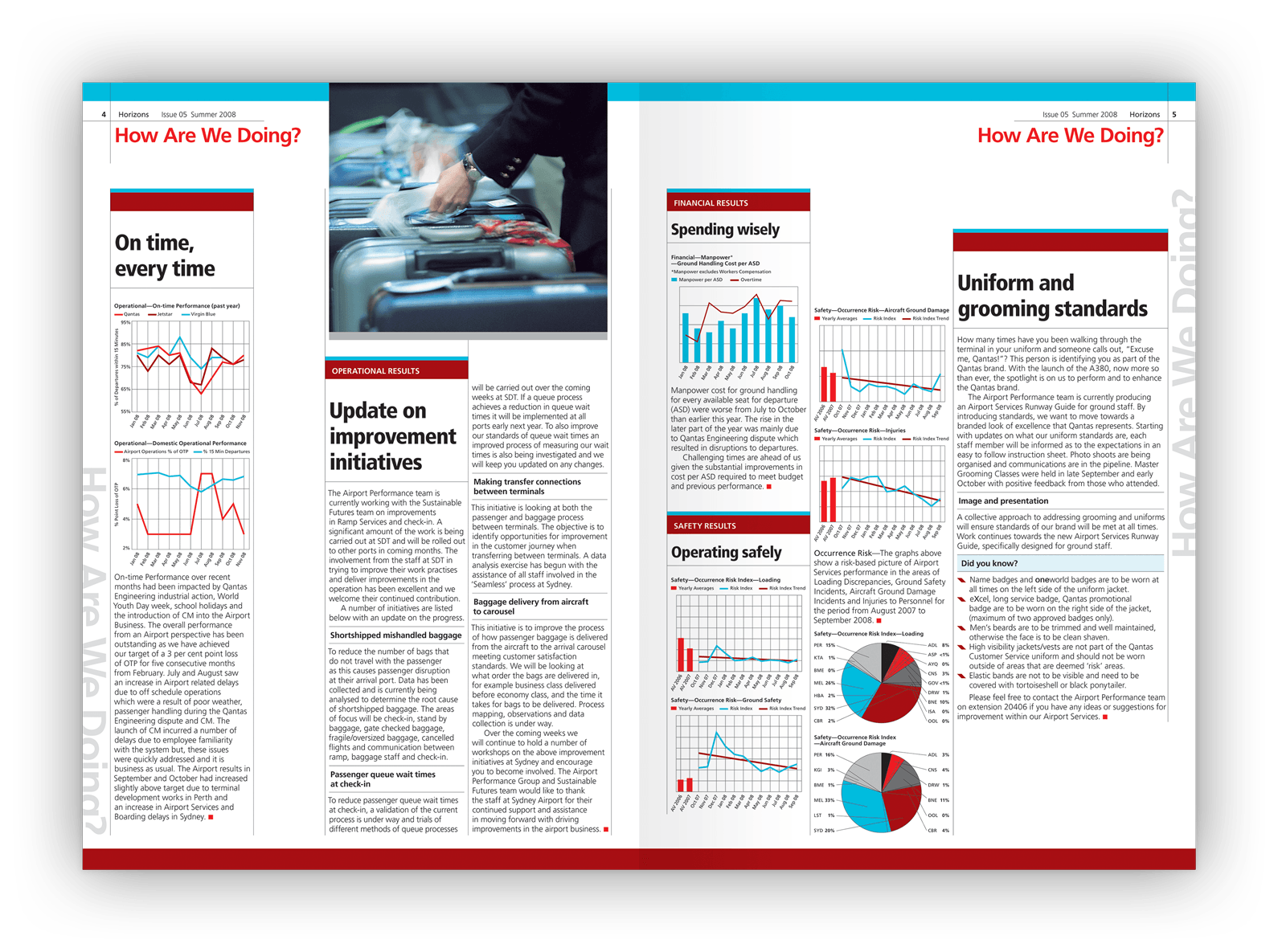
We were tasked to create a unique look for one of Qantas’s business units — the ground operations that service Australian airports — but our creativity was restricted by brand design guidelines.
The newsletter design
The motif
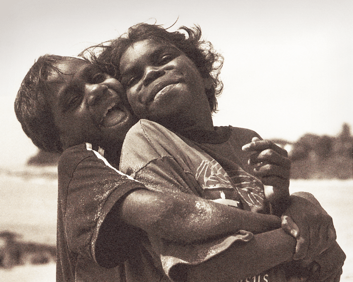
The newsletter’s name, Horizons, masthead, design, colours and layout use the horizon as a motif.
The horizon is the point at which sky meets Earth and was chosen as the symbol for the business’s ground operations: the place where aircraft (from the sky) meet the support facilities (on the Earth).
Colours
A dozen possible Qantas brand colours were available to designers (from Qantas’s internal brand guidelines) but we chose a simplified, restricted palette. Qantas’s ‘Sky Blue’ and ‘Red Earth’ brand colours were abutted to create a stylised horizon.
The colours formed a banner for each news article and decorative elements.
Masthead design
Negative space cuts into the masthead’s letterforms to imply the horizon.

Editorial design
A seven-column grid allowed for subtle variety in layout design and use of white space.
Specifications
> Two-year design and production contract
> Horizons quarterly report covering major news topics and long-term developments (16–28 pages)
> Horizons Monthly Updates for brief updates on progressing stories (2–8 pages)
> Horizons Newsflash for urgent news releases (1–2 pages).
Creative awards
Gold Award — Creativity Annual Awards.
Want to know more?
Contact James Armstrong for a chat about this project, your project, or a design quote.