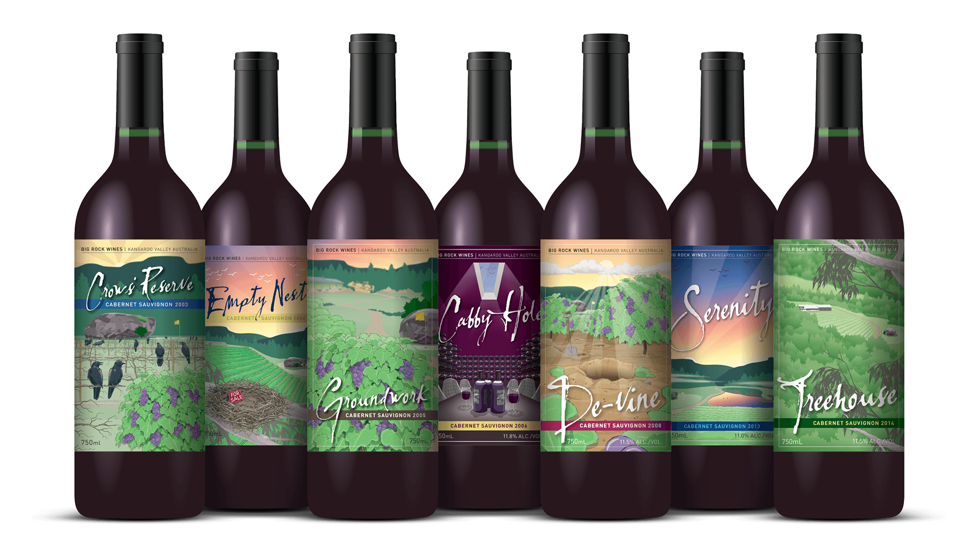
Design visuals
The story behind the design
Big Rock Wines is a boutique winemaker in Kangaroo Valley, NSW, producing under 2,000 bottles per year and distributing to its local region only.
We were tasked to create an eye-catching presence for the wines, with some local appeal, to draw the eye of tourists who pass through the area.
As a brand story, it was an underwhelming (but humorous) start to the winemaker’s journey. The vineyard’s first commercial output was ravaged on the vine by crows before harvesting could commence.
Whilst a disastrous setback for some, this event helped shape the personality for the brand early on and informed all subsequent designs: fun, self-deprecating and gracious.
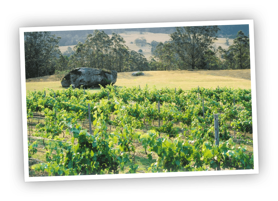
Above: Big Rock Wines is named for the large boulder that dominates the property — our muse.
The wine label designs
Each label is a visually stylised scene from the Big Rock Wines estate depicting that year’s milestone event (or other infamous development).
A recurring motif — the eponymous ‘big rock’ — is part of every visual story linking the wine label range together.
On the back label, a short anecdote explains the front label’s image and together they tell the brand story of the winemaker.
When placed alongside each other, all labels appear like they were designed together but the entire range was designed label by label, year by year, over an 11-year period from 2004–2015.
Crows’ Reserve
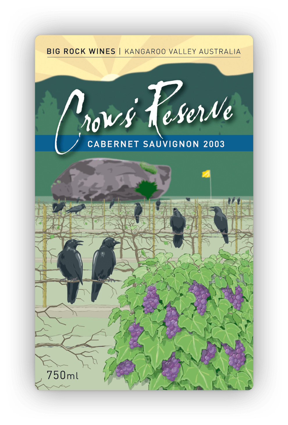
The story (extract from back label)
“In a country cursed by extreme weather conditions, this year’s cruel drought has paradoxically created ideal growing conditions at Big Rock Wines.
“The result has been grapes of tantalising quality — a sweet gift our local crow population found too delicious to ignore. The murder dined on 90% of the vineyard before our yearly harvest could commence.
“We’re honoured by Mother Nature’s enthusiastic — if somewhat destructive — endorsement. And we’re grateful that Her bird life saved the best of the crop for human consumption.”
Empty Nest
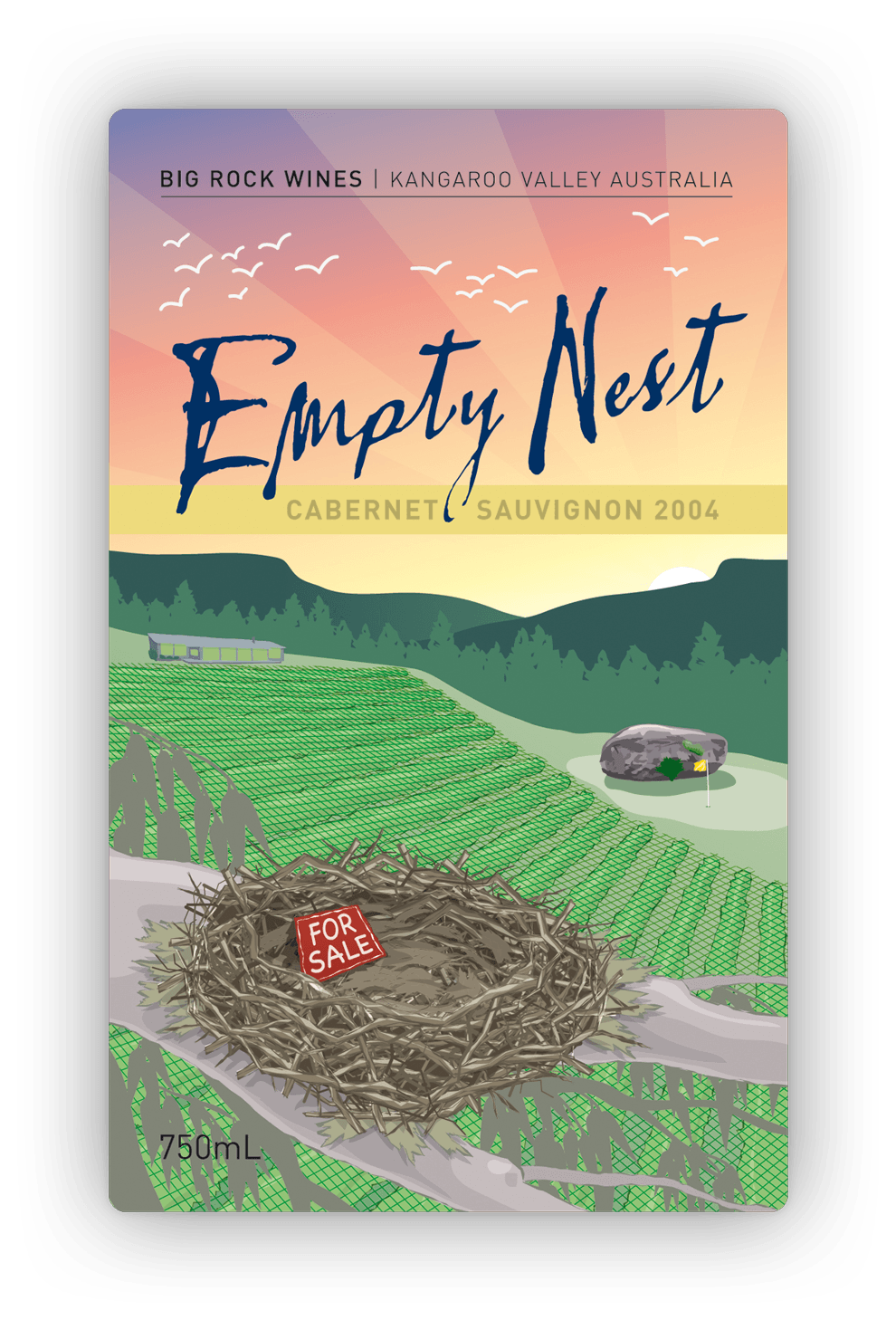
The story (extract from back label)
“The gobbling of last year’s grapes by local crows forced us to take improved defensive measures — protective netting over the entire vineyard.
“As a result, 2004 has been a bittersweet year at Big Rock Wines. On one hand, our human residents were rewarded by a plentiful harvest, creating this light and sweet tasting red.
“But the bird life fared poorly. With their major food source now out of reach, these feathery opportunists have had to move elsewhere for a free feed.
“If only they could have taken a few bottles with them.”
Groundwork
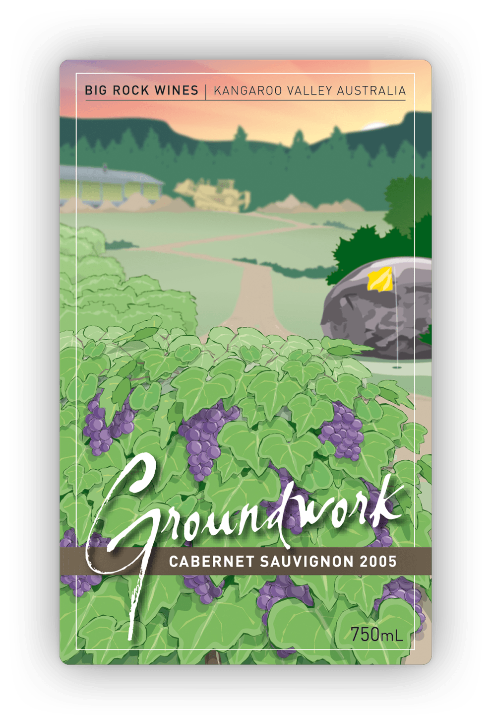
The story (extract from back label)
“Those who think winemaking isn’t dirty work never visited Big Rock Wines this year.
“We’ve been busy laying down many foundations for the future: a dedicated cellar; guest accommodation; and most excitingly, another smooth, sweet and light tasting red from the little vineyard with the big name.
“We love making improvements to our wine. And whether this takes ‘another two weeks‘ (as our builders keep saying), or many more years, we look forward to delivering.”
De-vine
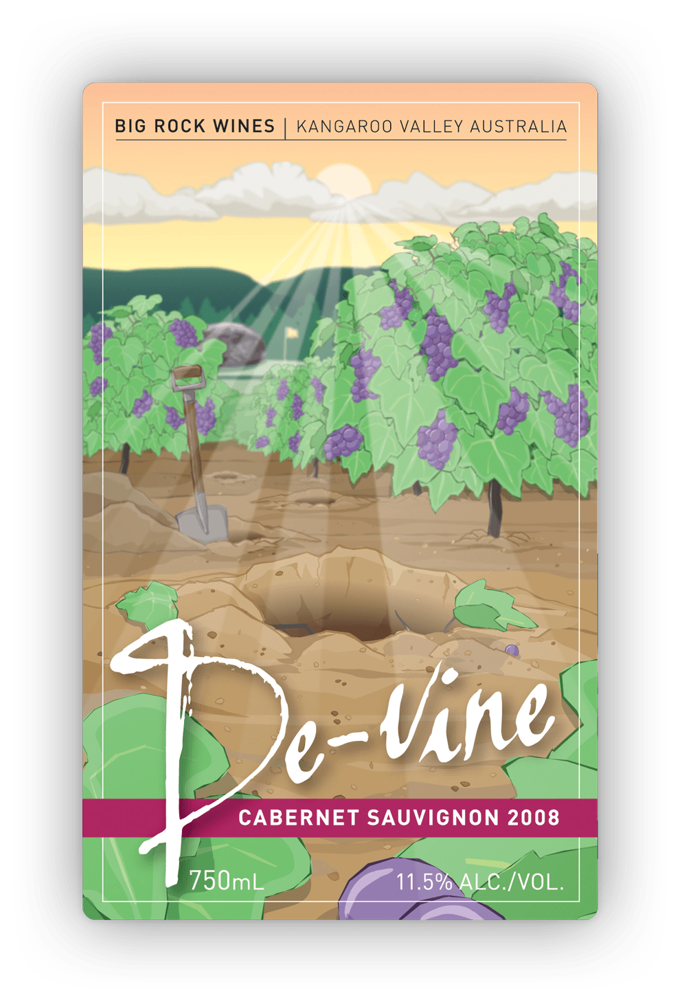
The story (Extract from back label)
“They say if you really love something: set it free.
“This year at Big Rock Wines, we took this advice literally. We uprooted and disposed of every second vine.
“The added room in the vineyard allowed each remaining plant to flourish, doubling the annual harvest’s volume of sweet and light tasting red. It was a counter-intuitive yet divine result for lovers of Big Rock Wines everywhere.
“Less truly is more.”
Serenity
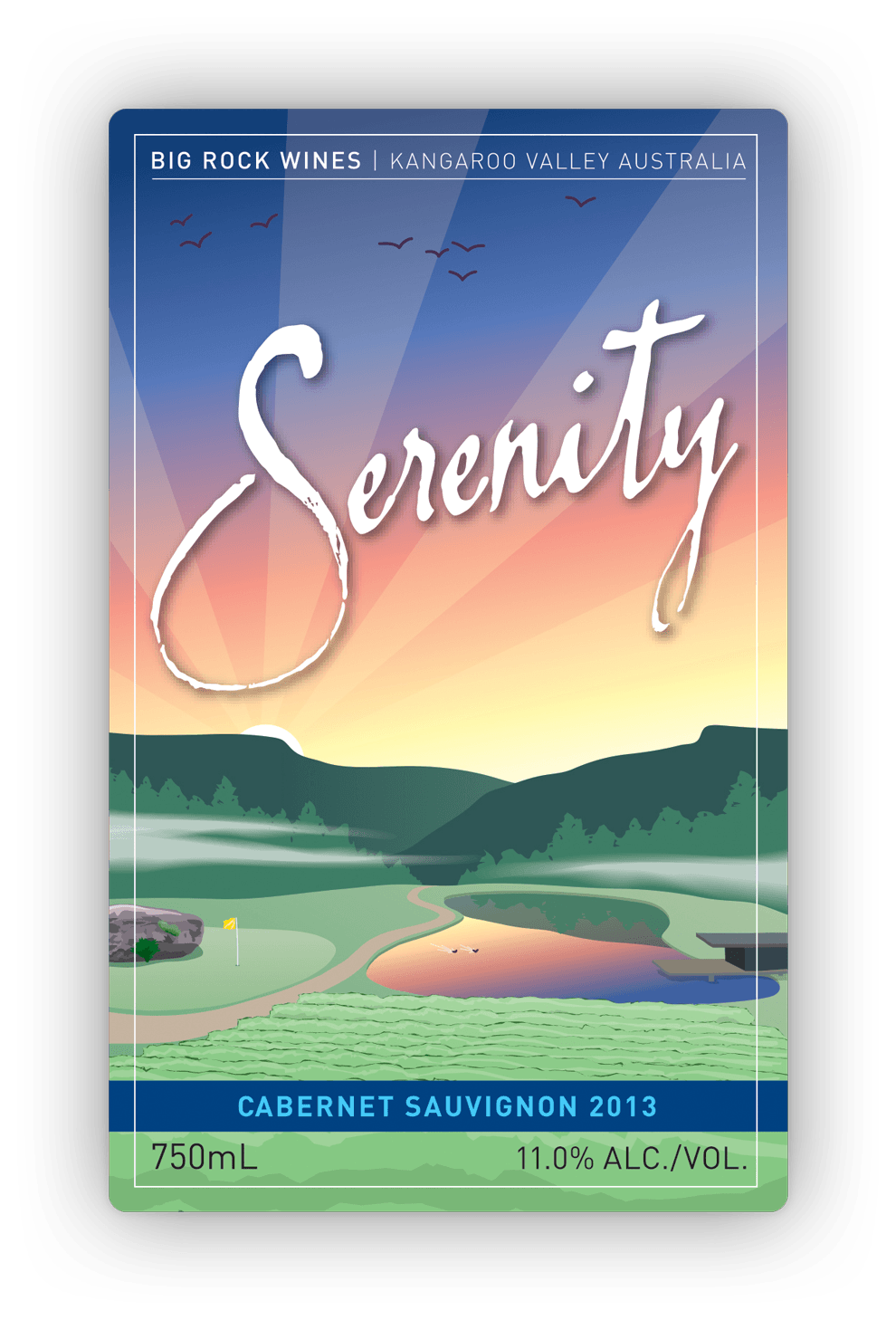
The story (Extract from back label)
“At the end of a busy day nurturing the vines, there’s nothing quite as relaxing as sitting on the deck, overlooking the vineyard at Big Rock Wines and enjoying the peace and tranquility — unless you also have a glass of Serenity on hand, to accompany the view.
“Serenity is our favourite light- to medium-bodied Cabernet Sauvignon — an easy-drinking wine with a soft pallet.
“It’s the perfect choice for a late-afternoon drink with Mother Nature … or for sharing quiet times with good friends.”
Treehouse
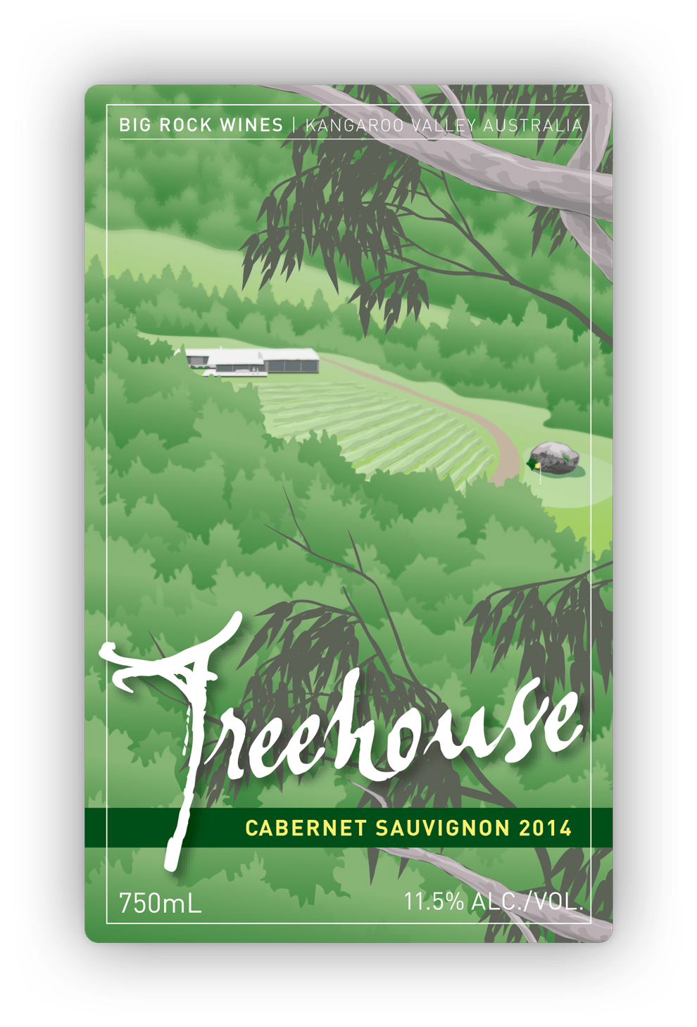
The story (extract from back label)
“This year at Big Rock Wines, we started looking at wine in a very different way — from the Treehouse.
“The Treehouse is our latest addition — a guest house perched high upon the hills, offering visitors magnificent views across the valley and down over the entire Big Rock Wines estate.
“Treehouse is also the namesake for our latest light- to medium-bodied Cabernet — an easy-drinking wine with a soft pallet.
“Now you can sit back and enjoy some Treehouse, while sitting back enjoying the Treehouse.”
Specifications
> 14 wine labels (front and back) for seven vintages
> Standard wine label size: 80mm x 130mm.
Want to know more?
Contact James Armstrong for a chat about this project, your project, or a design quote.